Back in the days when the world was black and white
and people had names for all the shades of grey,
value defined everything.
and people had names for all the shades of grey,
value defined everything.
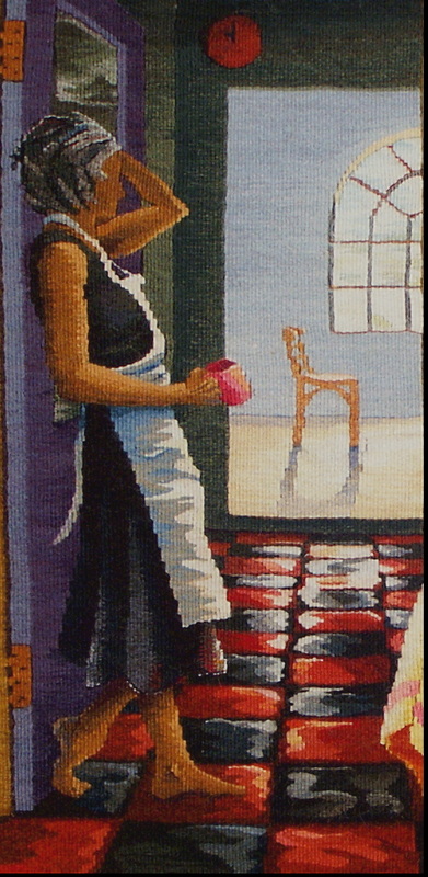
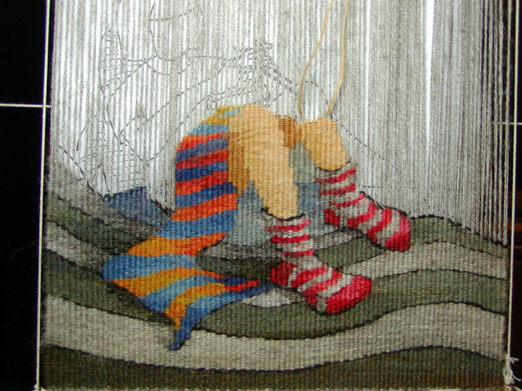
Miss Havisham's Cook (detail) ©Sarah C. Swett 2004
|
Value set mood
and carved the landscape
It made floors look shiny and implied the feeling of air.
|
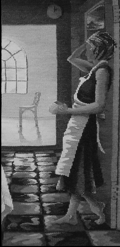
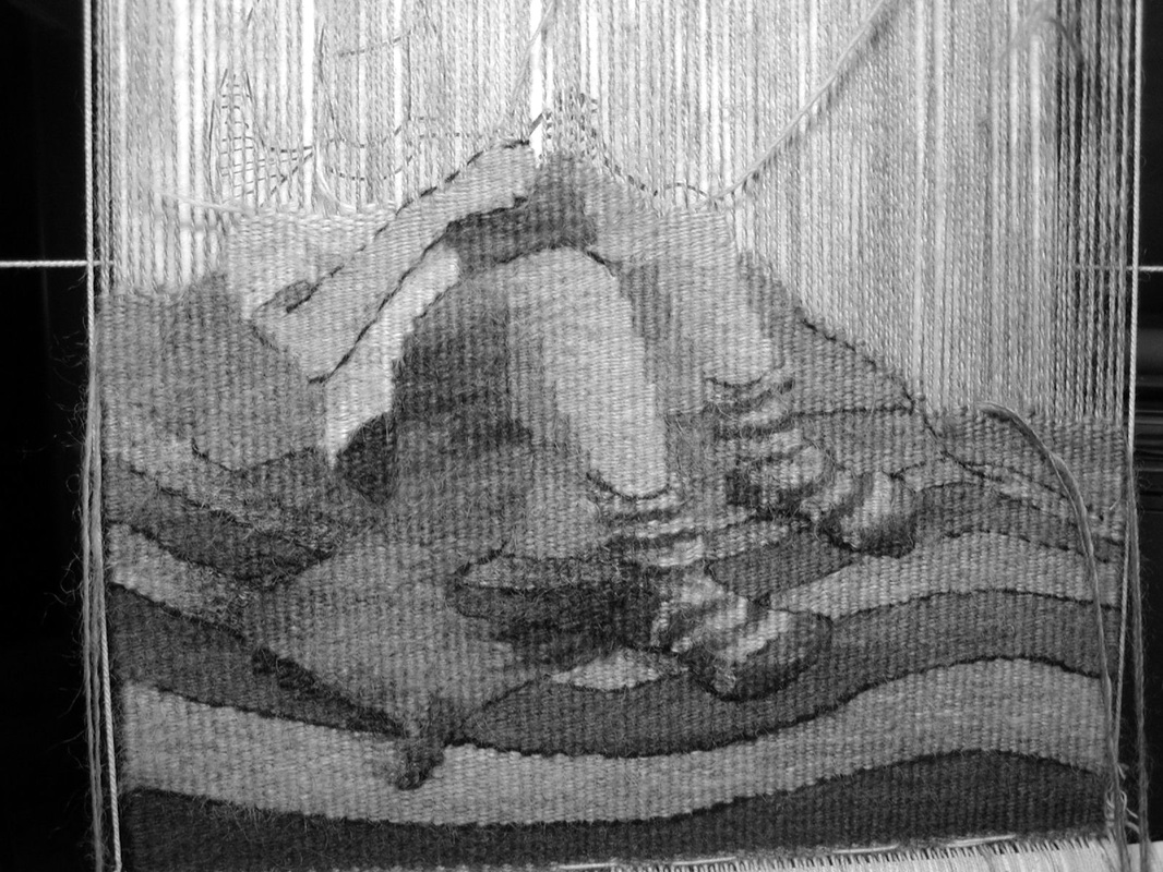
Miss Havisham's Cook (detail reversed) ©Sarah C. Swett 2004
|
Value: the relation of one part of a tapestry to another in respect to light and shade,
planted cups on tables, scribed undulations into cloth
and gave definition to faces.
It still does.
planted cups on tables, scribed undulations into cloth
and gave definition to faces.
It still does.
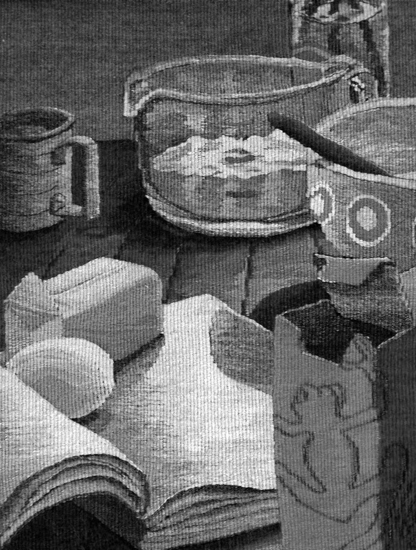
Two Recipes for Coffee Cake (detail) ©Sarah C. Swett 2007
Light plays across objects in particular ways regardless of hue,
so a stick of butter looks like a stick of butter and an egg appears smoothly curved because the surfaces of objects are defined by light and shadow rather than by words.
A box of baking soda, which we might notice first because of its distinctive orange hue, is recognizable in black and white because of its proportions and the awkwardly torn opening at the top. A weaver rendering such a box is helped as much by the value-- the relative lightness and darkness of the parts of the box -- as by the color.
Further, when placing that box of baking soda in a composition without the distraction of color, it is useful to see that the dark side of the baking soda box is darker than the dark side of the butter and that the richest part of the shadow cast by the butter is darker than both. This is important information whether the objects are the hue we expect, or not.
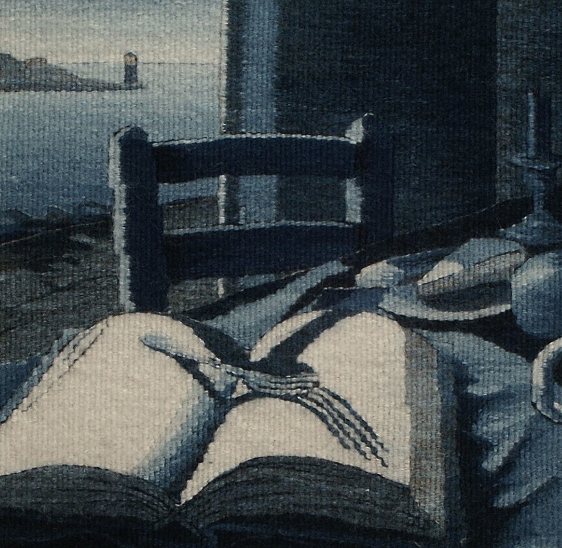
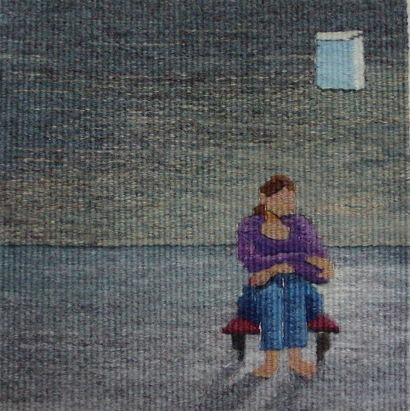
Lincoln Blue (detail); Lincoln Wool, Indigo ©Sarah C. Swett 2003 Notice how the chair shows up against both the light window and the dark wall because its shape is defined by light and dark
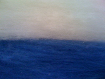
Of course things were not really black and white.
Every region had its own particular hue: one place was blue, another golden.
Every region had its own particular hue: one place was blue, another golden.
|
On this side of the mountains
was a land of green, on that, violet. Across the water all was red. 
|
I like to imagine this as a time of clarity for tapestry weavers.
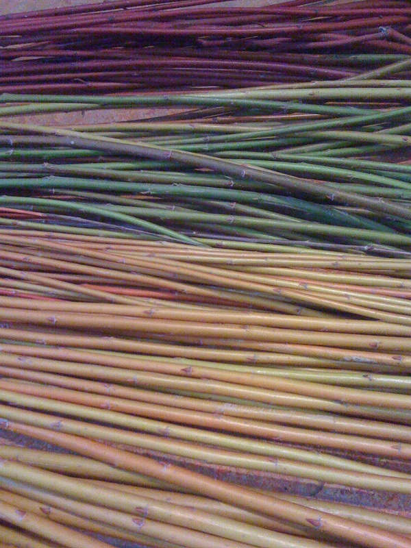
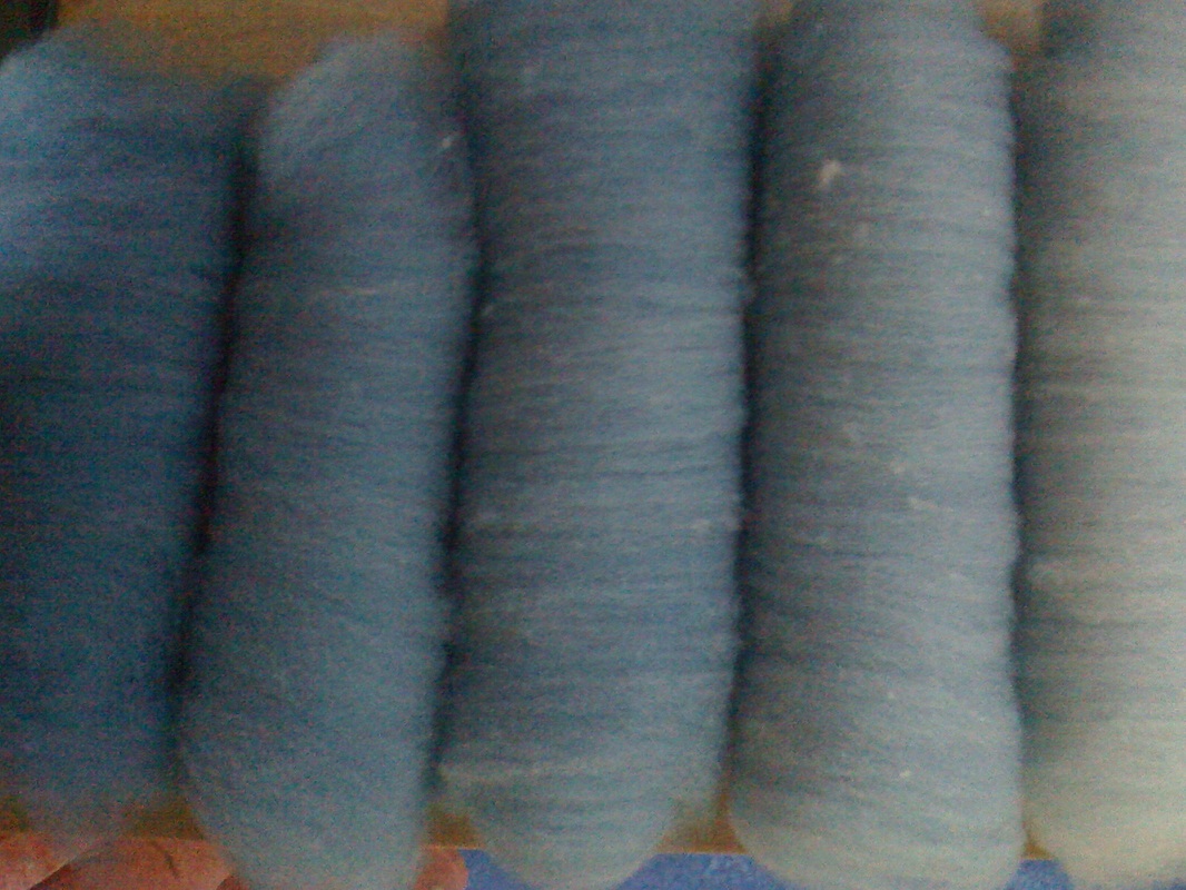
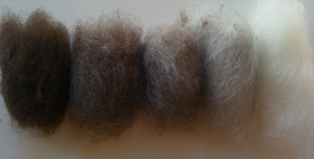
Regional sheep colors would have ranged from dark to light in the hue of that area,
as would yarn: alabaster to ebony here, blush to burgundy there,
and no matter the underlying color
the range of value, from light to dark and back again
would be pretty much the same.
Regional sheep colors would have ranged from dark to light in the hue of that area,
as would yarn: alabaster to ebony here, blush to burgundy there,
and no matter the underlying color
the range of value, from light to dark and back again
would be pretty much the same.
Spinners could extend the possibilities by blending.
|
|
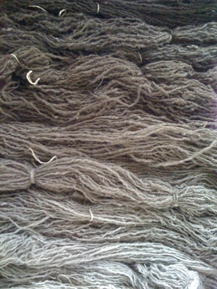
Weavers had merely choose an appropriate range
--this is the darkest and this will be the lightest --
select yarn to match their idea, and begin.
--this is the darkest and this will be the lightest --
select yarn to match their idea, and begin.
My earliest memories are of this mono-hued world
and I sometimes weave as though I am still there.
Eliminating color clarifies my thinking, defines an unfolding composition,
and allows me to focus on mood.
I can ask (and hopefully answer), one specific question at at time.
and I sometimes weave as though I am still there.
Eliminating color clarifies my thinking, defines an unfolding composition,
and allows me to focus on mood.
I can ask (and hopefully answer), one specific question at at time.
Value Question: How light will my lightest area be on this drawing, how dark the darkest,
and how many steps do I want between?
Decision: I want this to be a mellow tapestry not a dramatic one,
so though I have yarn that is darker brown and brighter white than I have chosen,
I don't want the intensity implied by such a broad value range.
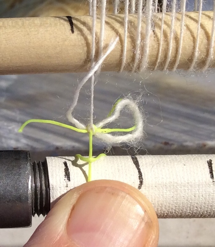
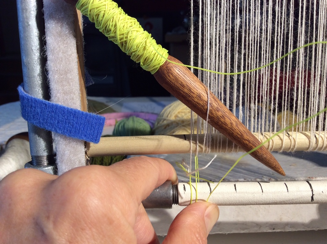
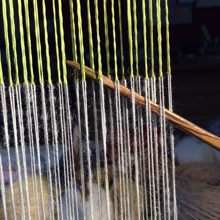
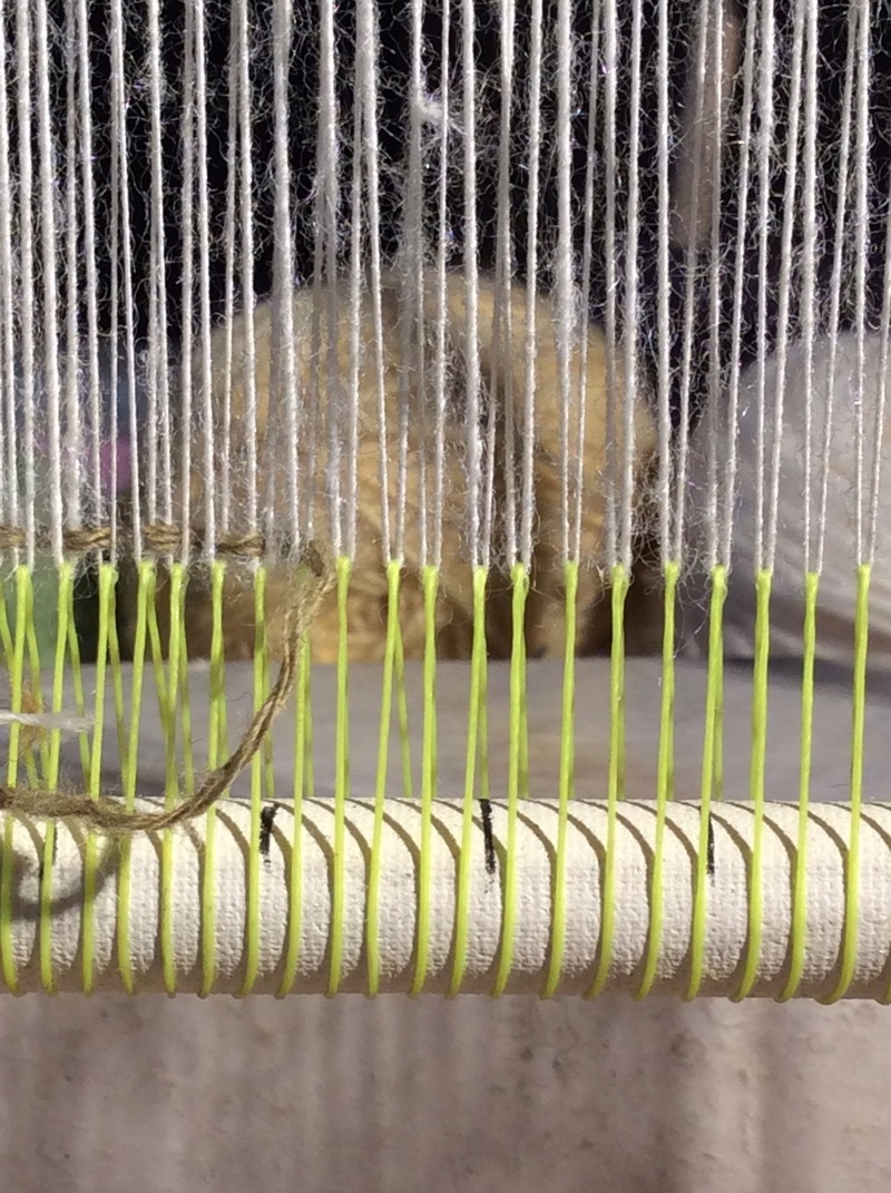
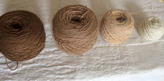
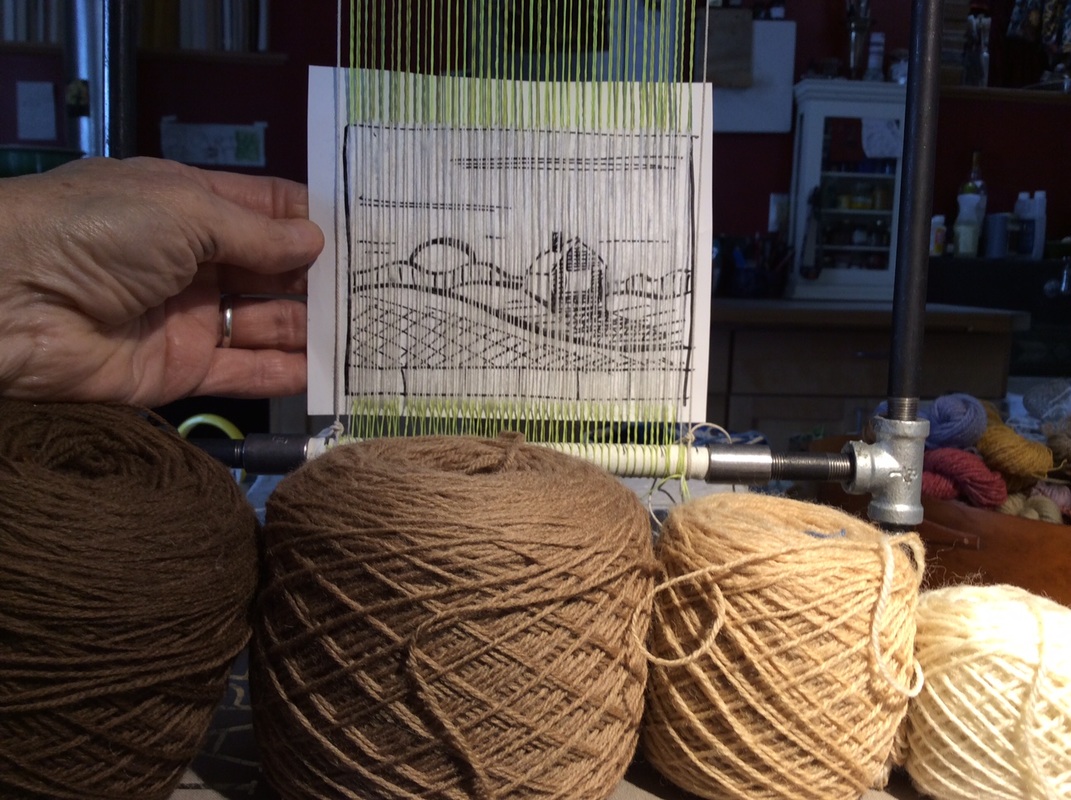
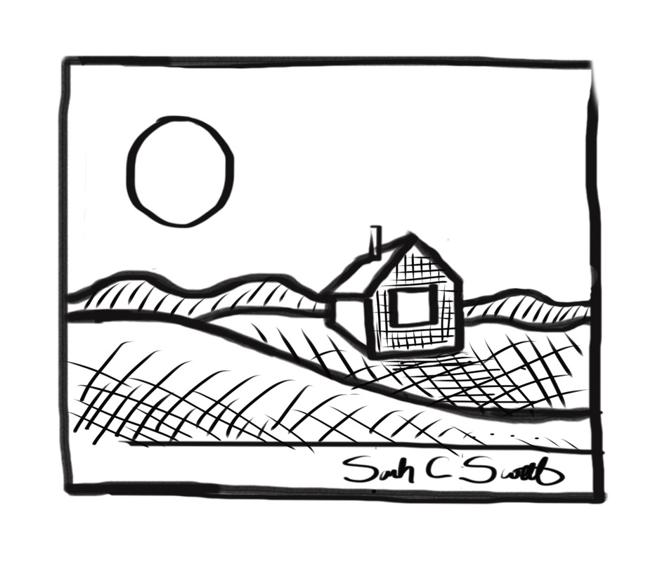
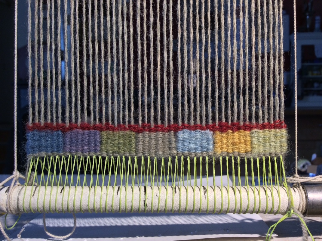
Also, the tapestry will be small, 3 1/2 " x 4 1/2" at a sett of 9 epi
and a limited palette of four balls of yarn is perfect for the scale of the cartoon
(cartoon is a name for the drawing used as a guide for weaving the tapestry)
Additional middle values are easy to make by blending with multiple wefts
so though I have yarn that is darker brown and brighter white than I have chosen,
I don't want the intensity implied by such a broad value range.
Also, the tapestry will be small, 3 1/2 " x 4 1/2" at a sett of 9 epi
and a limited palette of four balls of yarn is perfect for the scale of the cartoon
(cartoon is a name for the drawing used as a guide for weaving the tapestry)
Additional middle values are easy to make by blending with multiple wefts
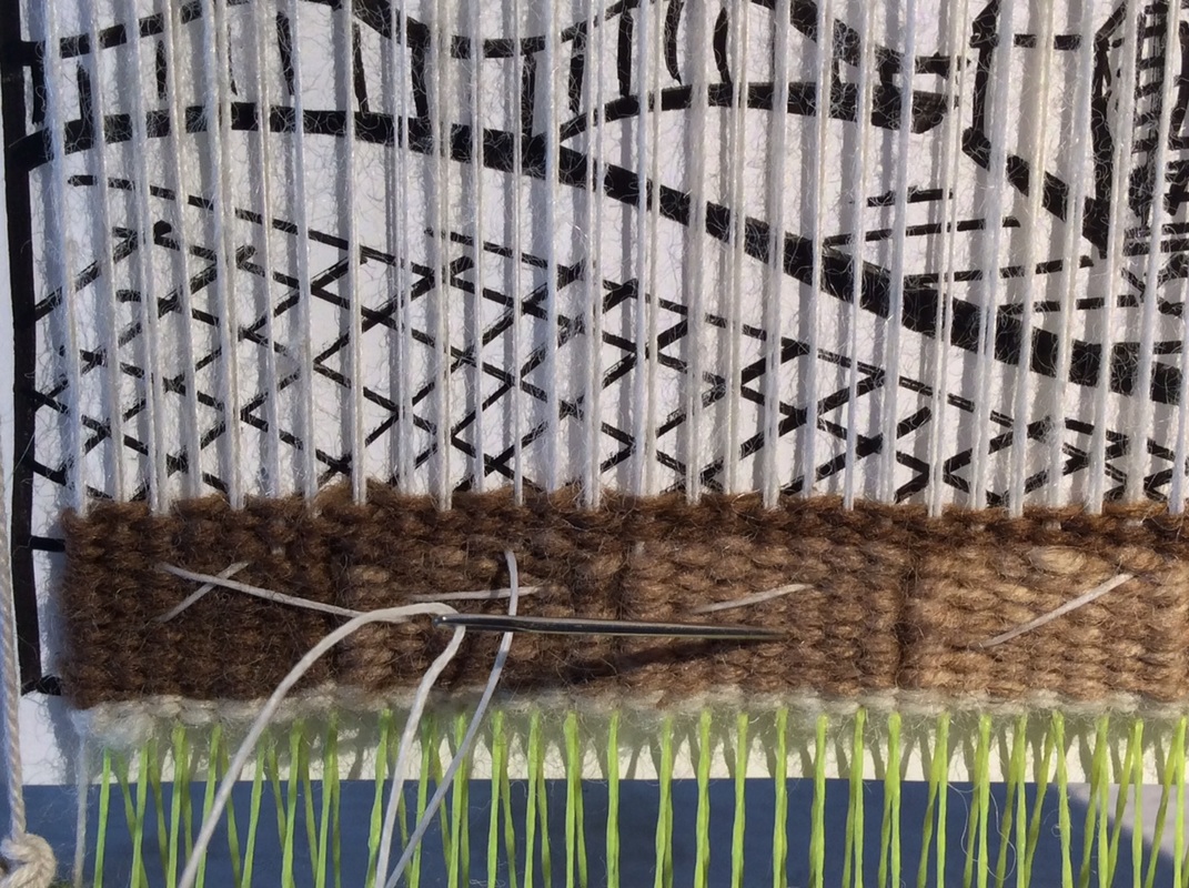
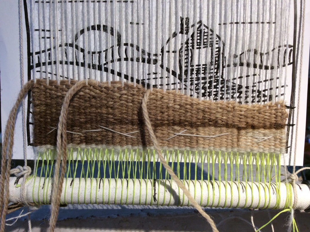
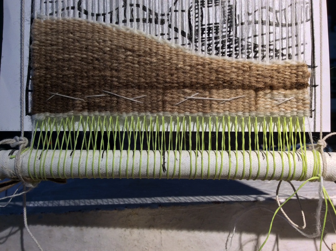
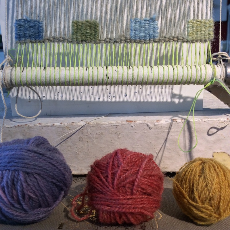
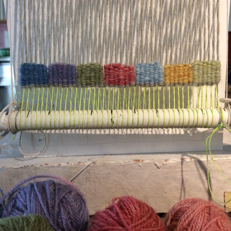
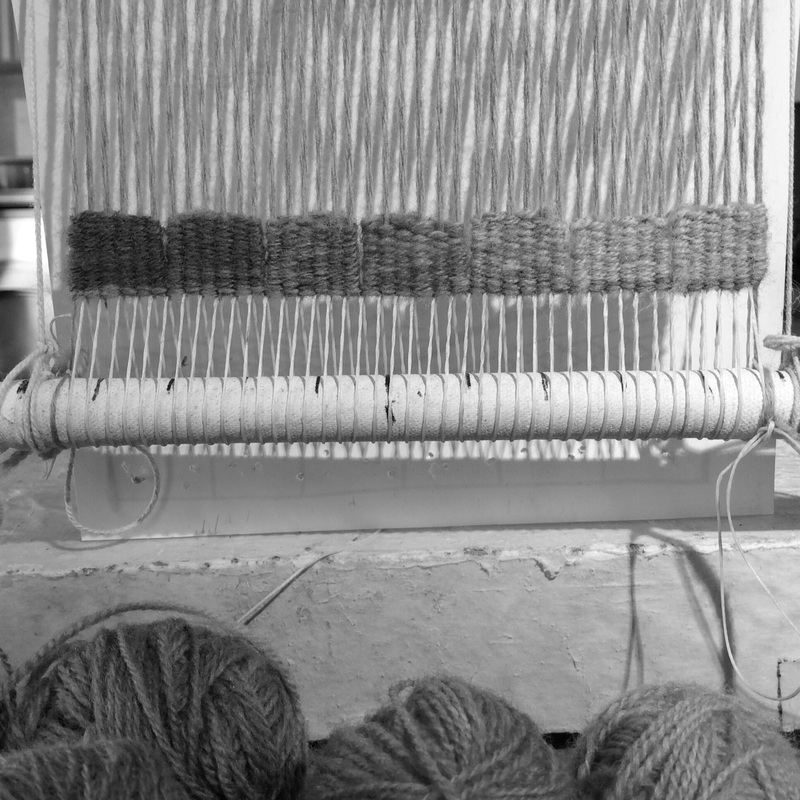
Laying out the possibilities in order at the bottom of the tapestry gives me a border and a handy value reference. It also provides a series of easy shapes to start with so I can start weaving without much angst.
In this work, I decided to put the darkest value on the left
adding weight to the shadow at the bottom of the hill I am about to begin building.
In this work, I decided to put the darkest value on the left
adding weight to the shadow at the bottom of the hill I am about to begin building.
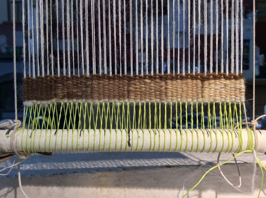
The Lightest color is not on the scale but will be used later.
|
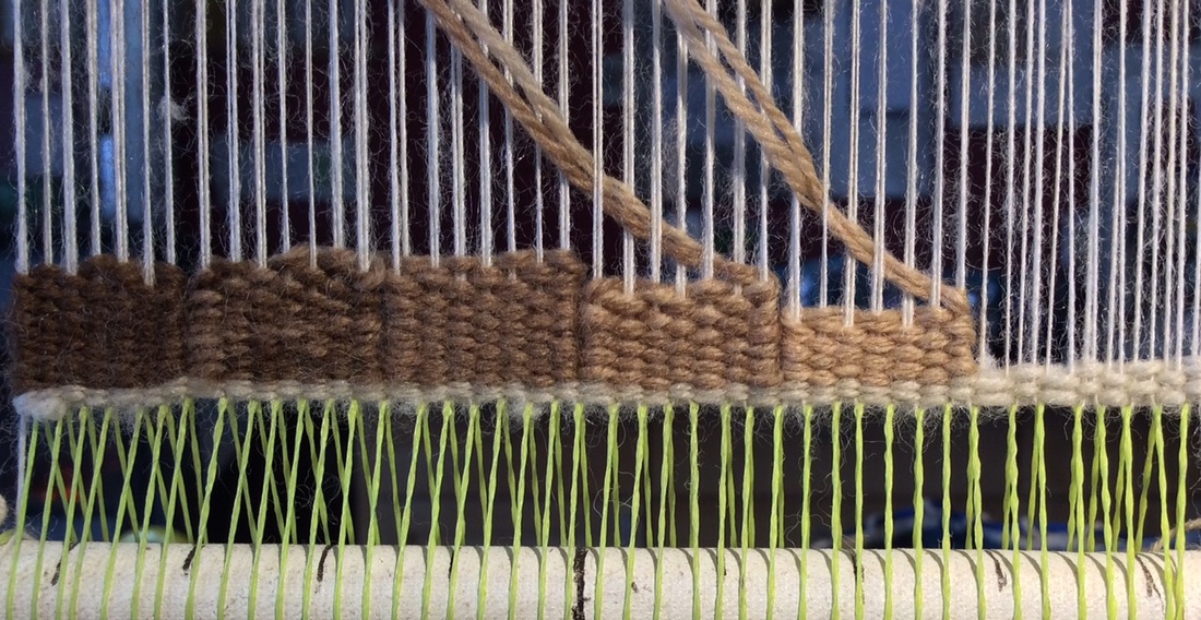
Value blocks make a useful base for stitching on a cartoon so i can see it while I weave. It is by no means an exact representation of what I will weave, but gives me an idea of where I am.
|
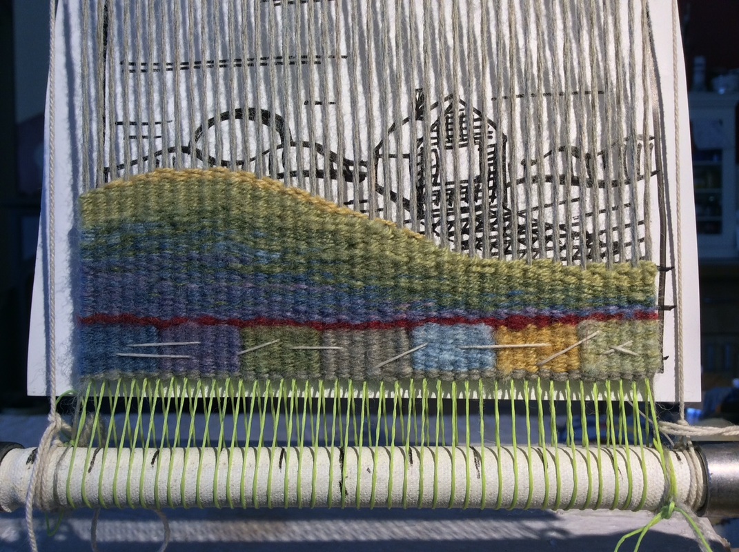
Value Question: Should the dark value on the lower left of the hill be the very darkest in my range or the next one in?
And how light should the top of the hill become?
And how light should the top of the hill become?
Decision 1. Start with the blend rather than the solid dark brown. There is already a nice weighty lump of dark on the lower left that is echoed/extended by the line at the top of the color blocks and that should be enough.
Also, I want to minimize the number of bobbins I have to deal with.
I hope to use no more than three values/blends across the shed, so starting with a blend means fewer bobbin changes. Irregular hatching allows me to build the shape while evenly progressing from the shadowed hollow of the hill to the curved top where the last light strikes.
I wove most of the hill with the weft running perpendicular to the warp,
but added a line of eccentric weft -- a loosely draped final pass of light yarn--
all the way down the curved top of the hill to smooth and highlight it.
Eccentric weft is a useful technique for defining a curved shape but
it can distort the surface of a tapestry if there is not enough weft in the shed to 'stair step' down the woven shape. It also ceases to be effective if the angle or curve you are outlining is steeper than 45 degrees.
Value Question: Does the line of light yarn define the hill
or might an additional line of dark help to differentiate the first hill from the second?
Decision: A line of dark will be important as the tops of both hills have similar values.
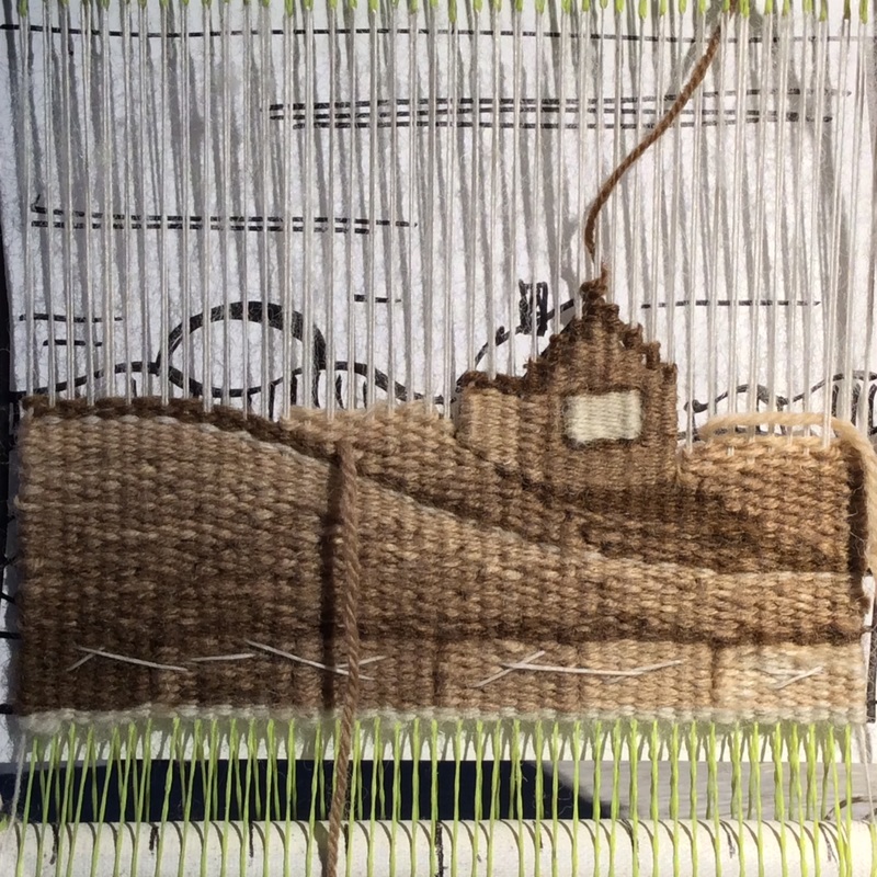
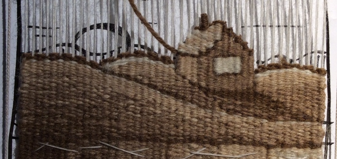
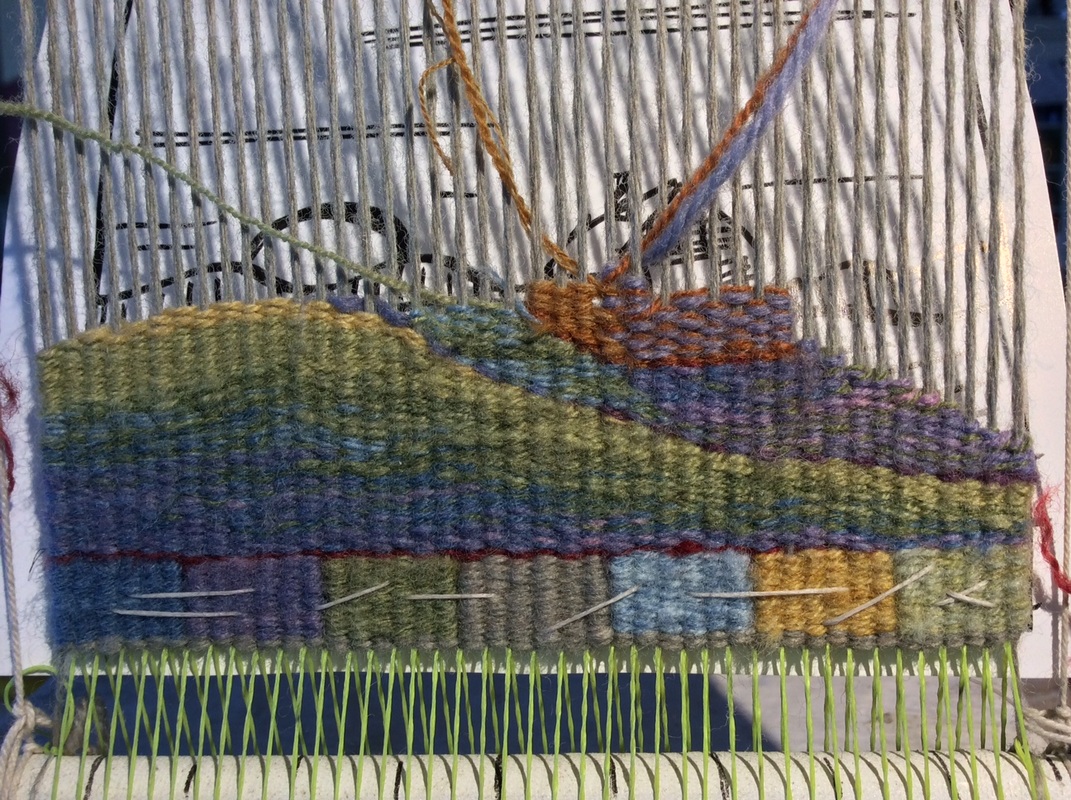
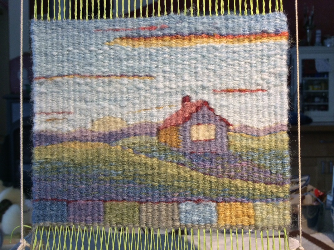
Value Question: How dark should the house shadow be?
Decision: If the entire shadow is the darkest value it will be heavy/stark. Better to weave most of it in the second darkest value then put in just a tiny bit of the pure dark brown at the base of the house to anchor it to the ground.
Value Question: I want the house to be a distinct shape but also belong in its environment.
Should the shadowed side be lighter or darker than the shadow it casts?
Decision: Make the house lighter than its shadow and give it a slightly different texture than the surrounding land by weaving it with a single strand of yarn.
Slits will also act as lines on the sides of the house
differentiating it from the surrounding hills.
Make the window the lightest of all and use a single strand of the lightest yarn
to connect it to what I think will be the value of the lightest part of the sky/ sun
Value Question: The roof--does it need an outline?
Decision: Yes. The outline defines the shape and implies a shadow, at least on the near side.
Value Questions: But how light should the roof be?
How dark the distant mountains?
Decision: The roof should not be as light as the window,
nor as light as the brightest part of the sky behind it.
Its shape will be defined by the outline on the near and left sides.
The small slits on the left, between the roof and the sky
also make a subtle line. It does not need more.
Decision changed -- outline on the peak of the roof is too much. Remove.
Decision: The distant mountains could be a middle value to allow for distance and atmosphere, but for some reason I decided to use the second darkest color.
Can't remember why but it must have felt right at the time.
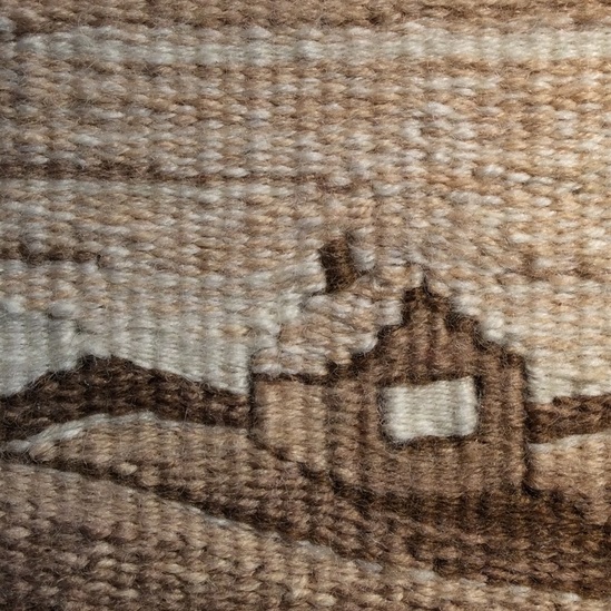
Note that the light sky behind the mountains is woven with a single strand of yarn (like the house) rather than two together. I think it makes it seem brighter. Also note that I did not leave a slit at the corner of the house, but joined the two color areas with alternating passes of weft. The window has slits on the sides.
Value Question: How light should the sky be?
Uniform as in the cartoon, or should it grow darker as it moves toward the top?
How dark the clouds?
Decision: A few lines of cloud pull a hint of the darker value upward
Light at the bottom of the top cloud makes it seem bigger and closer
and also pulls a bit of light toward the top of the image, helping the eye to move around.
The sky should get slightly darker toward the top as skies do,
but not too dark or it will become heavy and shift the mood.
I know this because I made the top of the big cloud too dark when I first wove it.
I like it better now.

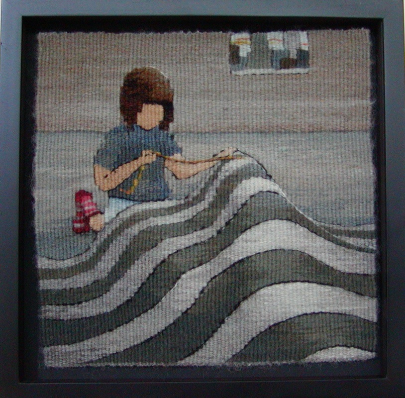
House on a Hill; 3 1/2 " x 4 1/2" Wool Warp and Weft; walnut dye
This tapestry weaving thing
is like a long reciprocal conversation
between my hands and the yarn,
the yarn and my brain,
my brain and the image,
the image and my hands.
Round and round it goes with no right answers
but lots of interesting problems to solve --
small shifts of yarn,
micro dramas with every pass.
and sometimes a bit (or a lot) of unweaving.
You never know what is going to happen.
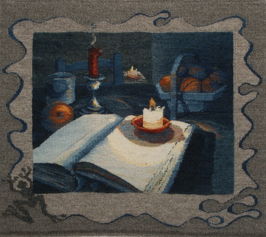
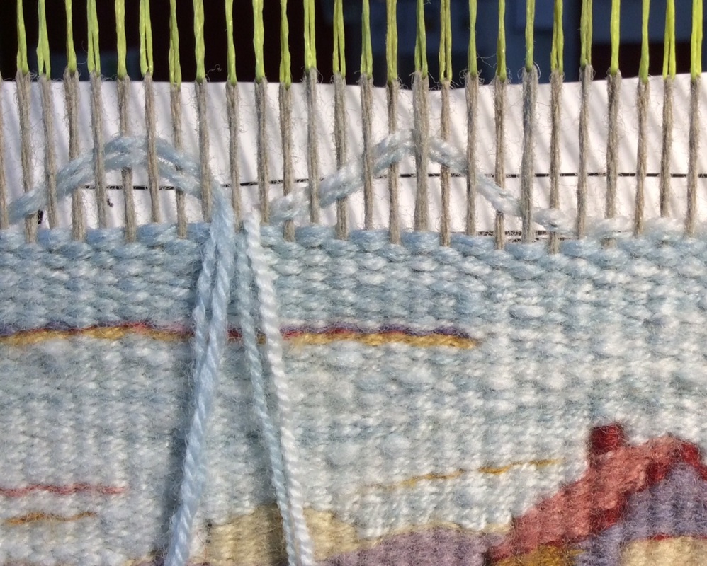
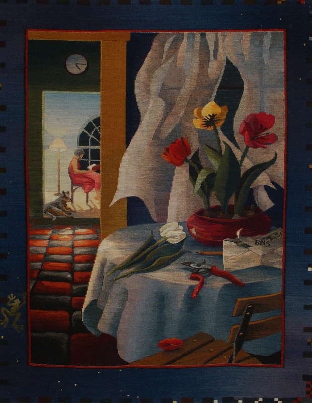
The Last Few Pages; wool, natural dye; 18" x 24" ©Sarah C. Swett 2003
As I mentioned earlier, my first memories are of a mono-hued world.
Yet I now live in one filled with color.
How this came to pass I cannot say, but I like to imagine a few adventurous golden souls crossing the prairie into a world of blue,
and cluster of green boats floating toward a region of red,
each hue sharing its skills and energy with the next.
What, I wonder, would it feel like to catch my first glimpse of violet if all I'd ever known was golden brown?
The truth of that story will probably remain a mystery,
but however it unfolded, the colors among which I now live are hard to ignore.
Lively and thrilling like exuberant children, they demand to be part of everything
but however it unfolded, the colors among which I now live are hard to ignore.
Lively and thrilling like exuberant children, they demand to be part of everything
|
And why shouldn't they be?
We have dyes. And eyes. Why not use these myriad hues to replicate the colors of in the world and let value take care of itself? Why not, indeed. It is beyond the scope of this blog post to delve too far into color theory, for it is a lifelong study in itself, but value can't help but be part of the process, because colors have minds of their own and each hue, while consistent within its family, behaves entirely differently when hanging out with another. |
Here is a small example of a color/value surprise that bit me even after decades of practice.
|
|
Take a look at the bright orange and blue striped scarf on the left.
See what happens when the color is removed -- stripes gone!
But why does that matter?
After all, you can see the object for what it is in color so
who cares about the relative lightness or darkness of the hues?
Who hangs out in a black and white world anyway?
See what happens when the color is removed -- stripes gone!
But why does that matter?
After all, you can see the object for what it is in color so
who cares about the relative lightness or darkness of the hues?
Who hangs out in a black and white world anyway?
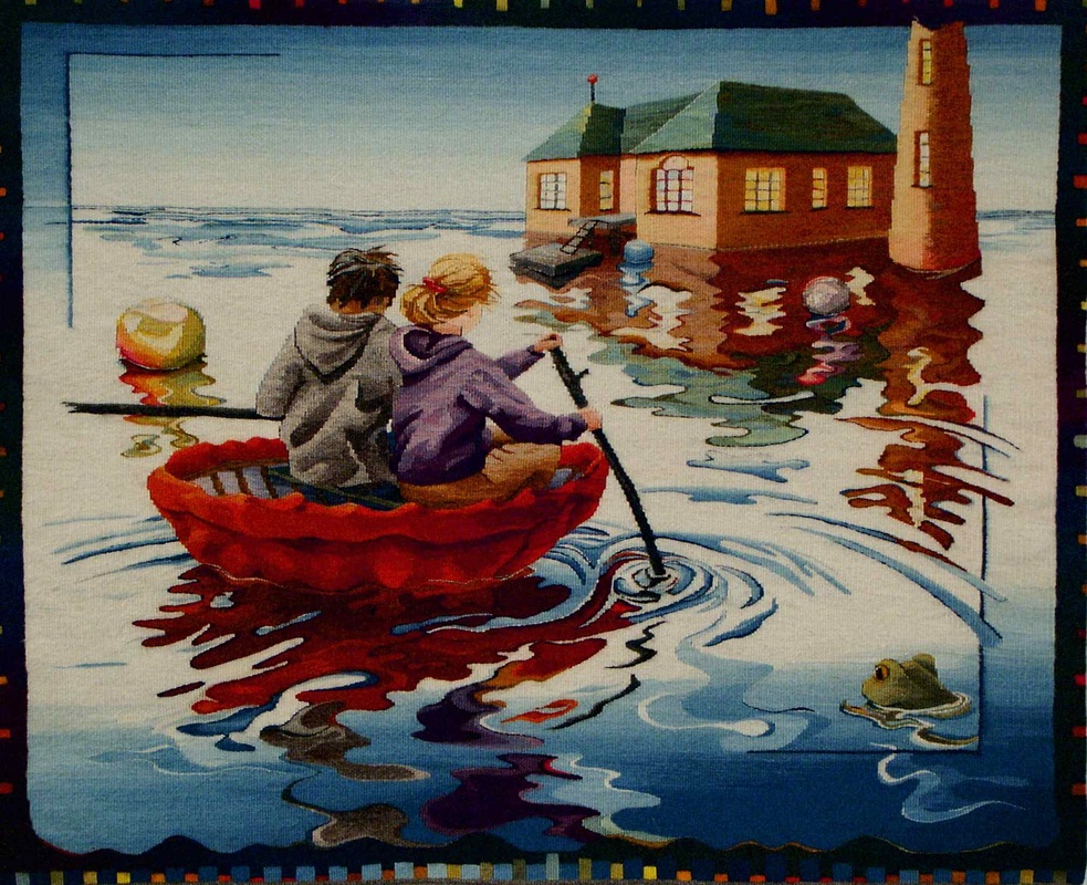
The Hut On The Rock; 40" x 48" wool, natural dyes ©Sarah C. Swett 2004; Notice that it is value that puts the coracle in the water and the people in the coracle. As the old saying goes, Value does the work, Color gets the credit.
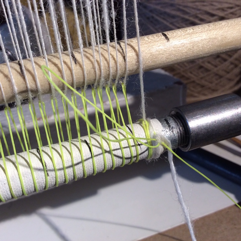
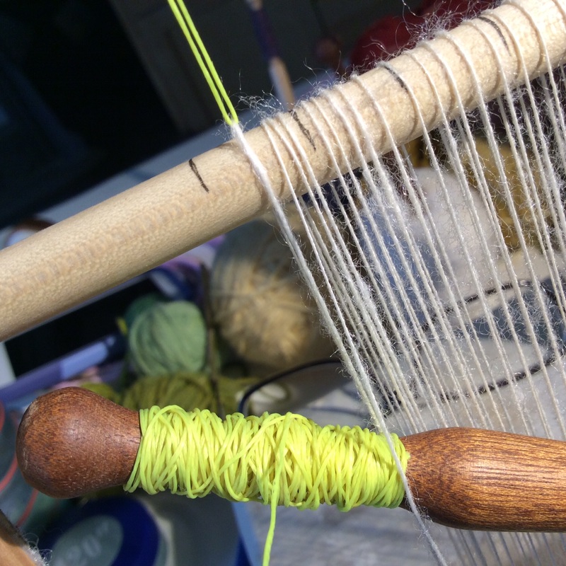
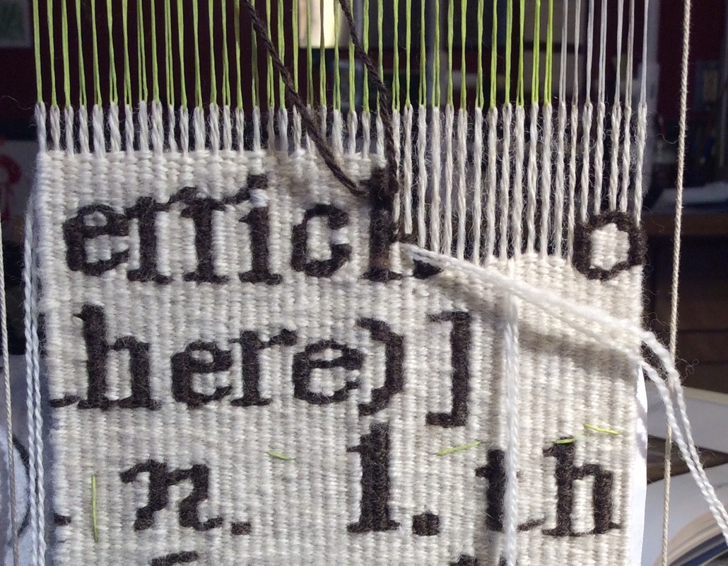
 Rough Copy #2 - detail in progress
Well I do for one, whenever I can.
Indeed, the best way for me to create really satisfying colorful tapestries is to begin in that mono-hued world I described earlier and not think about the color until I am actually weaving.
I can then choose every strand of yarn based on value choices I have already made.
This simplifies the early stages
and makes time at the loom incredibly exciting.
Here is my basic procedure:
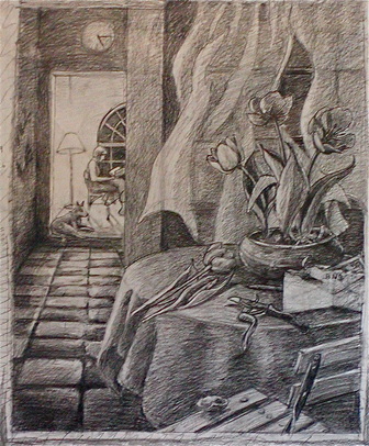
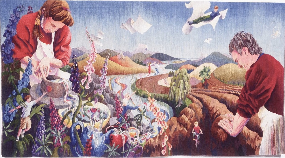
Miss Havisham's Gardener Cartoon; Graphite/ Paper 48" x 36" ©Sarah C. Swett 2005
|
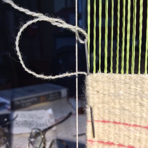
1. Make a Line Drawing with pencil on paper-- sometimes borrowing from my own photos but mostly just lifting simple shapes and ignoring detail. I want to be in charge of what I weave and not leave it to a camera that doesn't understand sett.
2. Scribble in the value and define form with pencils-- big soft ones are the most fun. 3. Erase. Draw. Erase. Draw Let image and mood evolve over time. One area might get lighter and lighter so even the darkest parts are lightish. Another, less of a focal point, might become muted so even the white things are grey. 4. Continue till I can't think of anything else to do. |
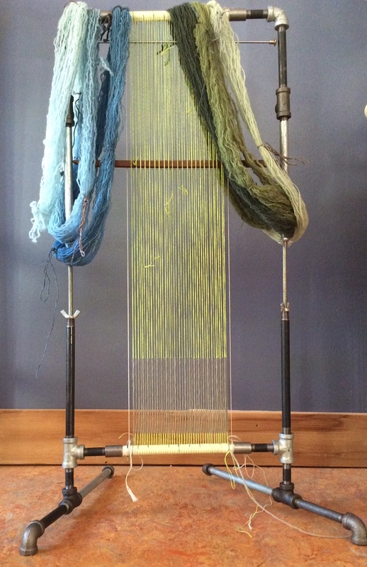
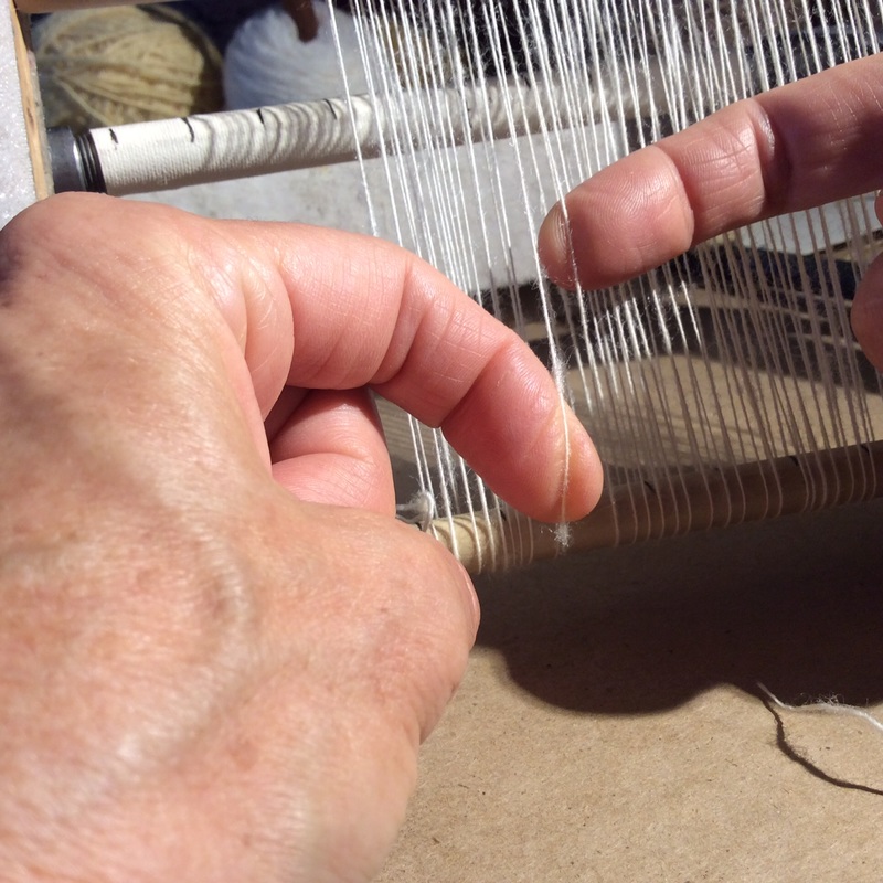
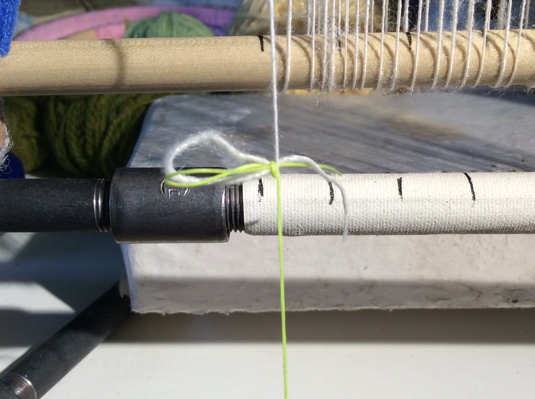
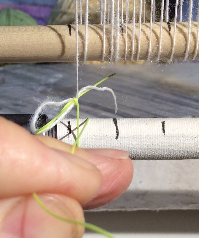
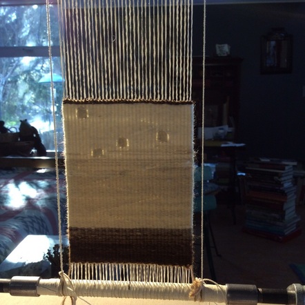
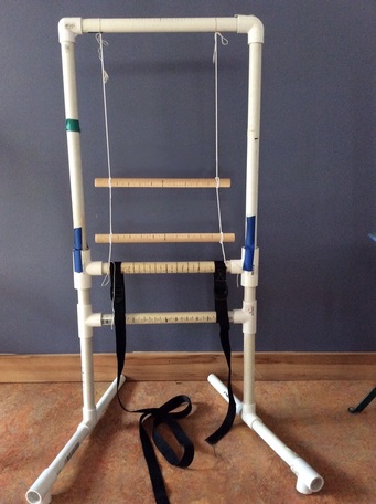
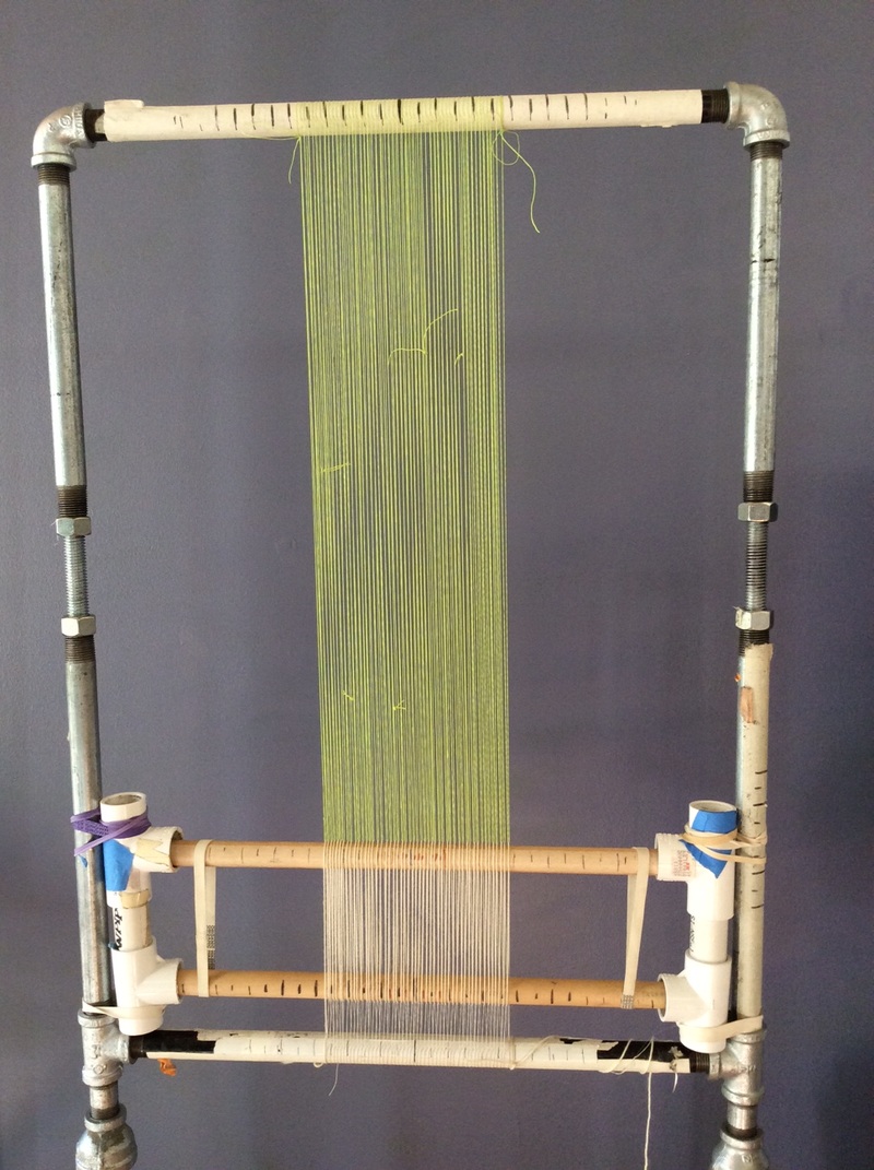
5. Enlarge my cartoon (if necessary), build a loom and warp it,
6. Choose one ball of yarn. All I need initially is something for the border. Everything else can and should build on that. Make subsequent choices based on what I have already woven.
Wool is not colored pencil, nor is it a marker, watercolor or light on a computer screen. It is a flexible column of air surrounded by many tiny fibers with untold facets and it, that thing we call a strand of yarn, will behave differently when woven than it does in the ball.
I cannot know how it will look until it is actually packed in.
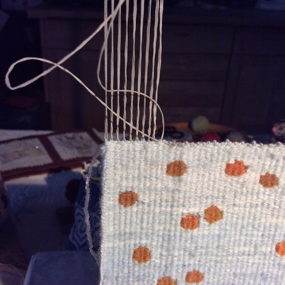
7. Arrange colors by area. When it is time to begin a certain part of the cartoon, I gather the value range for that thing in one basket: this group for the table cloth, this group for the floor, all the while comparing the relative value of that group with the cartoon and the other forms around it. Then I Continue to check the relative value of the yarn as I weave. Adding and subtracting as necessary.
Once upon a time I did this by squinting or looking at things in low light. These days, there are camera filters and apps that'll give you an idea of relative value in a second, though I still get to make the final decisions about everything. Cameras are not to be completely trusted.
Go for the glow.
6. Choose one ball of yarn. All I need initially is something for the border. Everything else can and should build on that. Make subsequent choices based on what I have already woven.
Wool is not colored pencil, nor is it a marker, watercolor or light on a computer screen. It is a flexible column of air surrounded by many tiny fibers with untold facets and it, that thing we call a strand of yarn, will behave differently when woven than it does in the ball.
I cannot know how it will look until it is actually packed in.
7. Arrange colors by area. When it is time to begin a certain part of the cartoon, I gather the value range for that thing in one basket: this group for the table cloth, this group for the floor, all the while comparing the relative value of that group with the cartoon and the other forms around it. Then I Continue to check the relative value of the yarn as I weave. Adding and subtracting as necessary.
Once upon a time I did this by squinting or looking at things in low light. These days, there are camera filters and apps that'll give you an idea of relative value in a second, though I still get to make the final decisions about everything. Cameras are not to be completely trusted.
Go for the glow.
|
|
Notice how the red on the bottom left is darker than the blue above it and how the darkest green on the lower right is only slightly darker than the orange on its right.
Notice how all of the reds are darker but also brighter than the blues.
Plan to use them deliberately and sparingly.
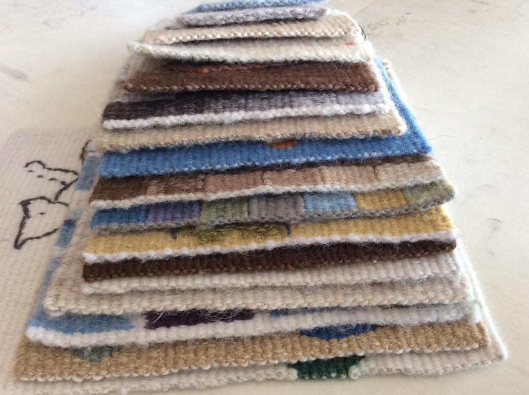
8. Spin and/ or dye to fill out the range or shift my color/ value focus in response to how the tapestry is unfolding.
9. Remain alert for unexpected design/color/value thrills and pitfalls
Notice how all of the reds are darker but also brighter than the blues.
Plan to use them deliberately and sparingly.
8. Spin and/ or dye to fill out the range or shift my color/ value focus in response to how the tapestry is unfolding.
9. Remain alert for unexpected design/color/value thrills and pitfalls
Miss Havisham's Gardener 50" x 38" wool, natural dye ©Sarah C. Swett 2005 NOTE: on the red floor the lightest red on the near tiles is the same yarn as the darkest red on the far tiles.
Noticing value is a thing for which a person needs to get in shape,
like running or birdwatching or playing music.
The only way to do it is to do it--over and over until chords become your friends
and a kestrel is a kestrel even whizzing by in a car.
It is curious, actually, that most of us will play tunes again and again to get them right, but rarely reweave the same cartoon. Yet each time there is the potential to notice something new.
Having already made some decisions, and knowing from experience what works and what doesn't in, say, shape building, you are free to push color blending or value .
Or do it the other way--first focus on color blending and then on shape making.
To help with this practice, if you're interested, here is a PDF of the cartoon for House on a Hill, the little brown tapestry I wove in detail up above. There are two versions -- with and without value hints, with and without a sun/ moon in the sky.
Click here, or on the image below to download it.
Print it out more than once if you like, and see happens with your hands and eye and yarn.
Working on this post made me want to weave a color version myself.
Below are some images of what I did (with less commentary than the brown one).
FYI: I was aiming for approximately the same value range as in the first.
Below are some images of what I did (with less commentary than the brown one).
FYI: I was aiming for approximately the same value range as in the first.
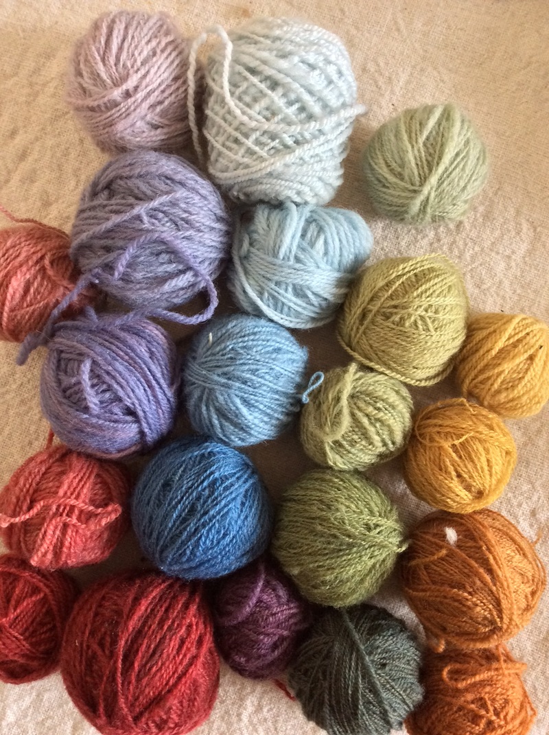
A place to start -- purple, green, blue from dark to light
|
The red looks great as a ball of yarn with the other balls of yarn, but maybe too bright when actually woven?
|
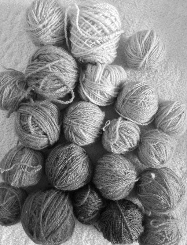
In black and white, the red block fits into the progression, but is a little dark
|
I decided that the red block was both too bright and too dark for its position at the bottom of the tapestry. The greyed green works better, but now the blue and yellow leap out. At this point, I imagined the house could be red, so wanted a little bit of that hue elsewhere. The line above the color blocks might do the trick -- dark but bright, the way red is.
As I wove this, I kept imagining other variations:
- If I turned the sun into a moon and made the the sky dark, what would the land do?
-If the darkest value were a creamy grey and the whole range very light, what would the landscape feel like?
- How dramatic could it be if the range of values went all the way from black to white?
Light yellow/green on top of the hill but no dark line.
Value blending in the sky. When I started I thought the house would be red. Turned out it was supposed to be the roof. This is a lesson I learn over and over and over.
|
The dark line only sits on the lower part of the hill
Pulled a little gold and red up into the sky.
|
I'm probably not going to get around to answering all these questions,
so can you?
And if you do, can you show me how it turns out?
On Instagram use #tapestryunlimited and tag me (@sarahcswett)
On Ravelry join the Vancouver Yarn Ravelry Group-- #tapestryunlimited
Thank you for reading so far
and I wish you the best of good fortune with all the tapestries in your future.
Here are a couple of final thoughts..
1. Own you work--
and notice what you like
not what you think someone else will like,
or you think I might like,
but what actually stirs you.
Love value transitions but hate hatching? Learn to dye to make the intermediate values.
Love color blending and value transitions but hate dyeing? Try weaving with different materials to get the values you seek -- perhaps texture and shadow can play a part.
If you are a spinner, start with dyed fiber and blend with cards or combs.
Love value but are annoyed by color? Weave your own mono-hued world.
|
2. Relish the open space between art and craft where tapestry weavers dance in the sun, working with concepts that create art and practicing skills essential to the craft. Tapestry is a medium of endless potential, ancient and contemporary at once, and the structural limitations of warp and weft are a source of tremendous freedom. 3. So go forth and weave. The world needs your work. |
So does the American Tapestry Alliance (ATA)
and its Tapestry Unlimited Exhibition,
an unjuried exhibition designed to showcase our best efforts at whatever level we find ourselves. There is more about both ATA and Tapestry Unlimited below,
but first, I want you to know that ATA is offering two prizes for participating in this blog tour:
The first is a one-year membership to the American Tapestry Alliance. The second is a one-year membership to ATA plus a free entry to the exhibition.
Current ATA members are not eligible to win, so there is lots of room.
I signed up for the exhibition today.
See you in the catalog!
The American Tapestry Alliance is a nonprofit organization that provides programming for tapestry weavers around the world, including exhibitions, both juried and unjuried, in museums, art centers and online, along with exhibition catalogues. They offer workshops, lectures, one-on-one mentoring and online educational articles as well as awards, including scholarships, membership grants, an international student award, and the Award of Excellence. They also put out a quarterly newsletter, monthly eNews & eKudos and CODA, an annual digest. Members benefit from personalized artists pages on the ATA website, online exhibitions, educational articles, access to scholarships and more.
---------
This blog tour is in celebration of ATA's annual unjuried exhibtion. Tapestry Unlimited; 11th International, Unjuried Small Format exhibition is open to all weavers. We are expecting upwards of 250 participants who will show their work at the Milwaukee Public Library this upcoming summer. Everyone who signs up to participate by January 31st 2016 will be included in the exhibition, and your tapestry does not need to be mailed to us until March 2016. There is an exhibition fee of $40 which pays for both the return postage for your tapestry as well an exhibition catalogue, which everyone’s tapestry will be featured in. We invite entries which work within more traditional definitions of tapestry as well as ones which expand upon them, including multimedia work.