a field guide to needlework
  • Tapestry
    • 1994 - 1999
    • 2000 - 2003
    • 2004 - 2007
    • 2008 - 2009
    • 2009 - 2012
    • 2013 - 2015
    • 2016 part one
    • 2016 - 2017
    • 2018
    • 2019
    • 2020
    • 2021
    • 2022
    • 2023
    • 2024
  • Newsletter
  • Store
  • Blog 2014-2021
  • About
  • Comics
    • Fatal Distraction
    • Manuscript Revised
    • Stripes
    • Enid and Crow >
      • Enid and Crow: Days In The Life
      • Enid and Crow: The Peregrinations
      • Enid and Crow: Color Choices
      • Enid and Crow: Carried Away
      • Enid and Crow: Somewhere!

The Value of Tapestry: Stop #6 on theTapestry Unlimited Blog Tour

1/27/2016

 
 Back in the days when the world was black and white
and people had names for all the shades of grey,
​value defined everything.


Picture
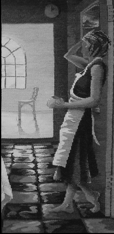
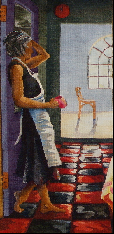
Miss Havisham's Cook (detail) ©Sarah C. Swett 2004
Picture
Value set mood


and carved the landscape

It made floors look shiny and implied the feeling of air.
Picture
Miss Havisham's Cook (detail reversed) ©Sarah C. Swett 2004
Value: the relation of one part of a tapestry to another in respect to light and shade,
planted cups on tables, scribed undulations into cloth

and gave definition to faces.

​It still does.
Picture
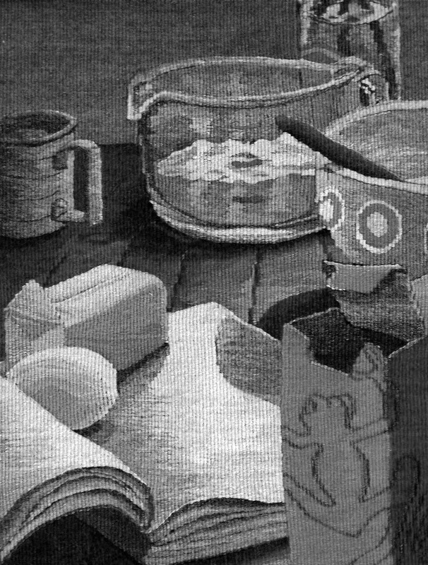
Two Recipes for Coffee Cake (detail) ©Sarah C. Swett 2007
 Light plays across objects in particular ways regardless of hue,
so
 a stick of butter looks like a stick of butter and an egg appears smoothly curved because the surfaces of objects are defined by light and shadow rather than by words.
A box of baking soda, which we might notice first because of its distinctive orange hue, is recognizable in black and white because of its proportions and the awkwardly torn opening at the top. A weaver rendering such a box is helped as much by the value-- the relative lightness and darkness of the parts of the box -- as by the color. 

Further, when placing that box of baking soda in a composition without the distraction of color, it is useful to see that the dark side of the baking soda box is darker than the dark side of the butter and that the richest part of the shadow cast by the butter is darker than both. This is important information whether the objects are the hue we expect, or not.
Picture
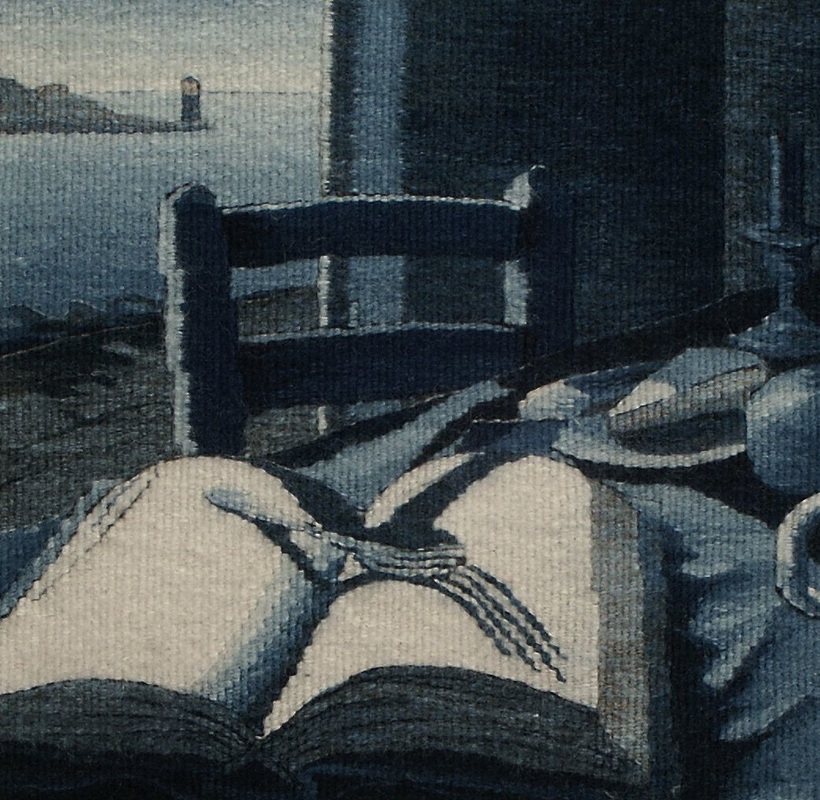
Lincoln Blue (detail); Lincoln Wool, Indigo ©Sarah C. Swett 2003 Notice how the chair shows up against both the light window and the dark wall because its shape is defined by light and dark
Of course things were not really black and white.
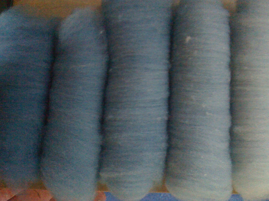
​Every region had its own particular hue: one place was blue, another golden.  
Picture
On this side of the mountains
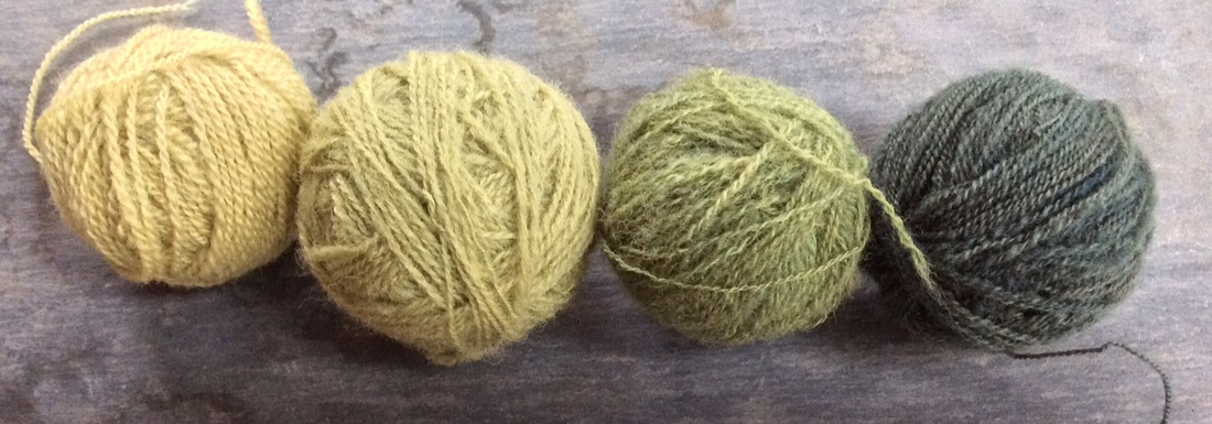
was a land of green,
​ on that, violet. 
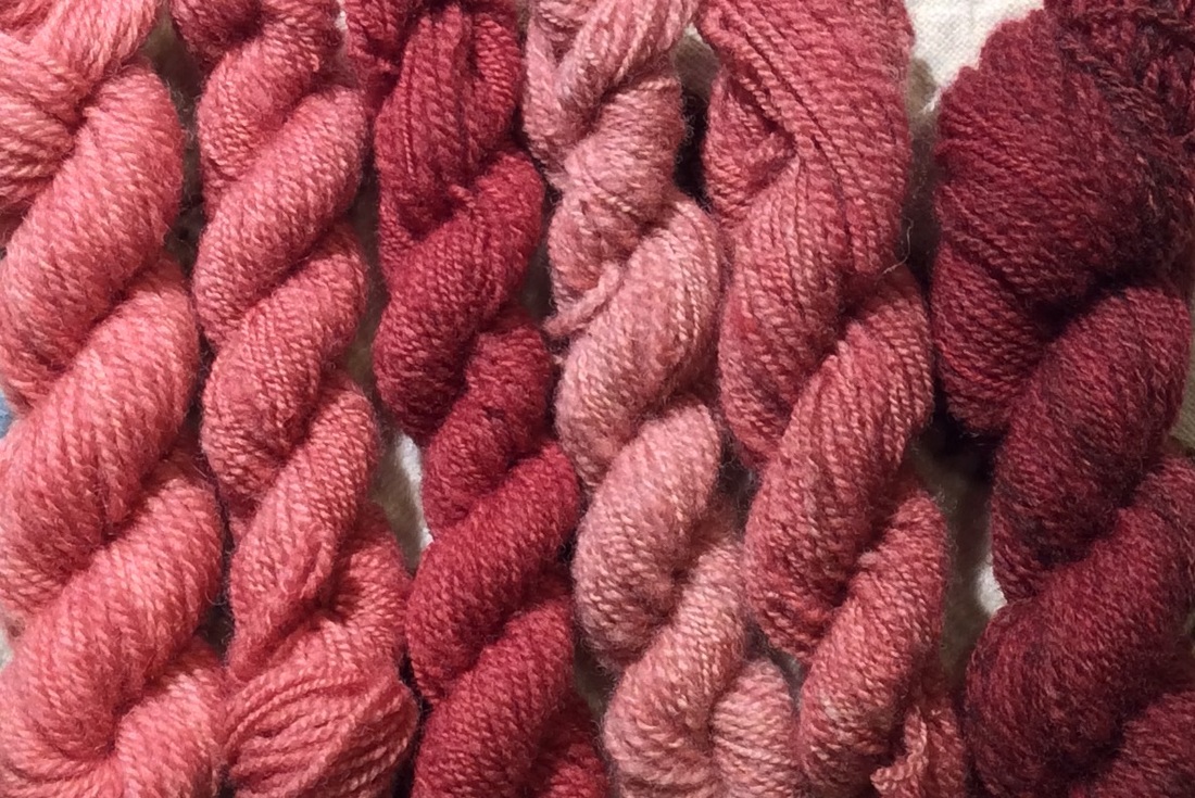
​ Across the water all was red.
Picture
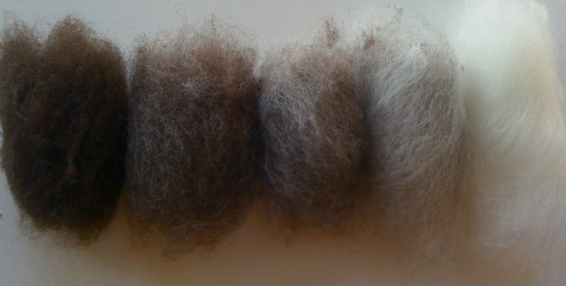
I like to imagine this as a time of clarity for tapestry weavers.
Regional sheep colors would have ranged from dark to light in the hue of that area,
as would yarn: alabaster to ebony here, blush to burgundy there,  
and no matter the underlying color
the range of value, from light to dark and back again
would be pretty much the same.
Picture
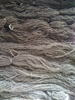
Spinners could extend the possibilities by blending. 
Picture
Picture
Picture
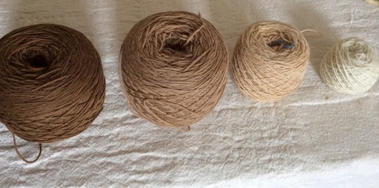
Weavers had merely choose an appropriate range
--this is the darkest and this will be the lightest --
select yarn to match their idea, and begin.
Picture
My earliest memories are of this mono-hued world
and I sometimes weave as though I am still there.

Eliminating color clarifies my thinking, defines an unfolding composition, 
and allows me to focus on mood.
I can ask (and hopefully answer), one specific question at at time.

Value Question: How light will my lightest area be on this drawing, how dark the darkest,
​and how many steps do I want between?
Picture
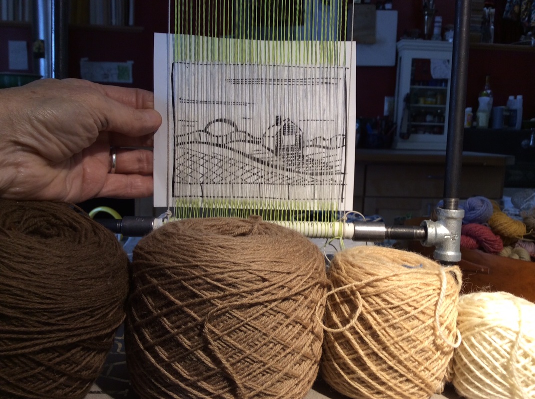
Decision: I want this to be a mellow tapestry not a dramatic one,
so though I have yarn that is darker brown and brighter white than I have chosen,
I don't want the intensity implied by such a broad value range.
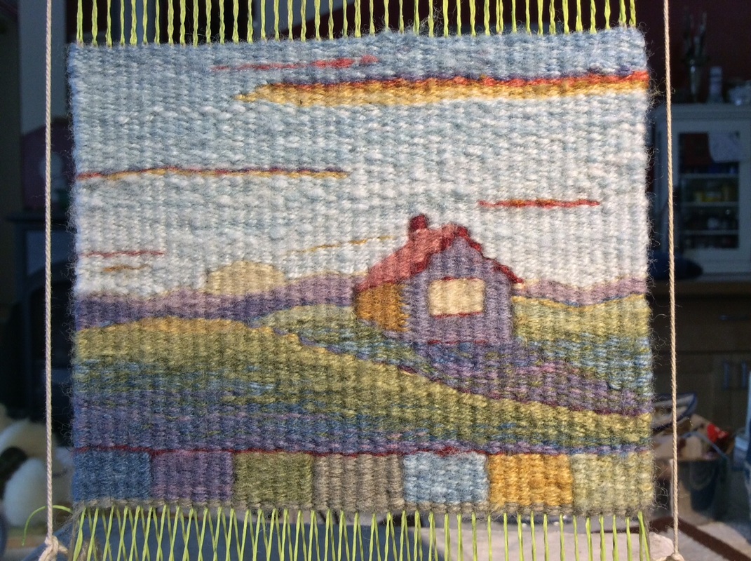
Also, the tapestry will be small, 3 1/2 " x 4 1/2" at a sett of 9 epi
 and a limited palette of four balls of yarn is perfect for the scale of the cartoon 
(cartoon is a name for the drawing used as a guide for weaving the tapestry)
Additional middle values are easy to make by
 blending with multiple wefts 
Picture
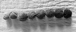
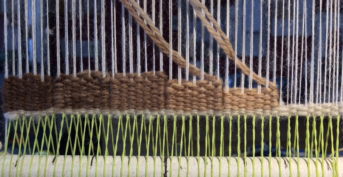
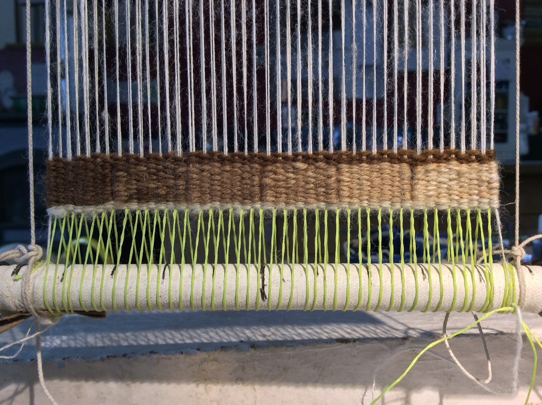
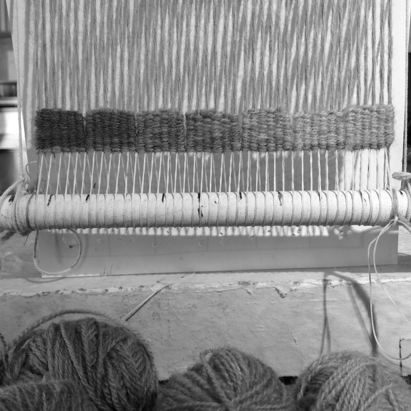
Laying out the possibilities in order at the bottom of the tapestry gives me a border and a handy value reference. It also provides a series of easy shapes to start with so I can start weaving without much angst. 

In this work, I decided to put the darkest value on the left
adding weight to the shadow at the bottom of the hill I am about to begin building.
Picture
The Lightest color is not on the scale but will be used later.
Picture
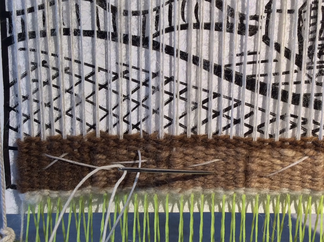
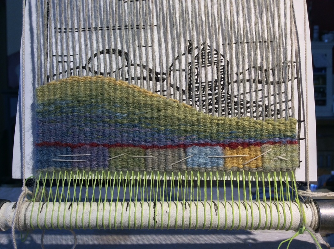
Value blocks make a useful base for stitching on a cartoon so i can see it while I weave. It is by no means an exact representation of what I will weave, but gives me an idea of where I am.
Value Question: Should the dark value on the lower left of the hill be the very darkest in my range or the next one in?  
​And how light should the top of the hill become?
Picture
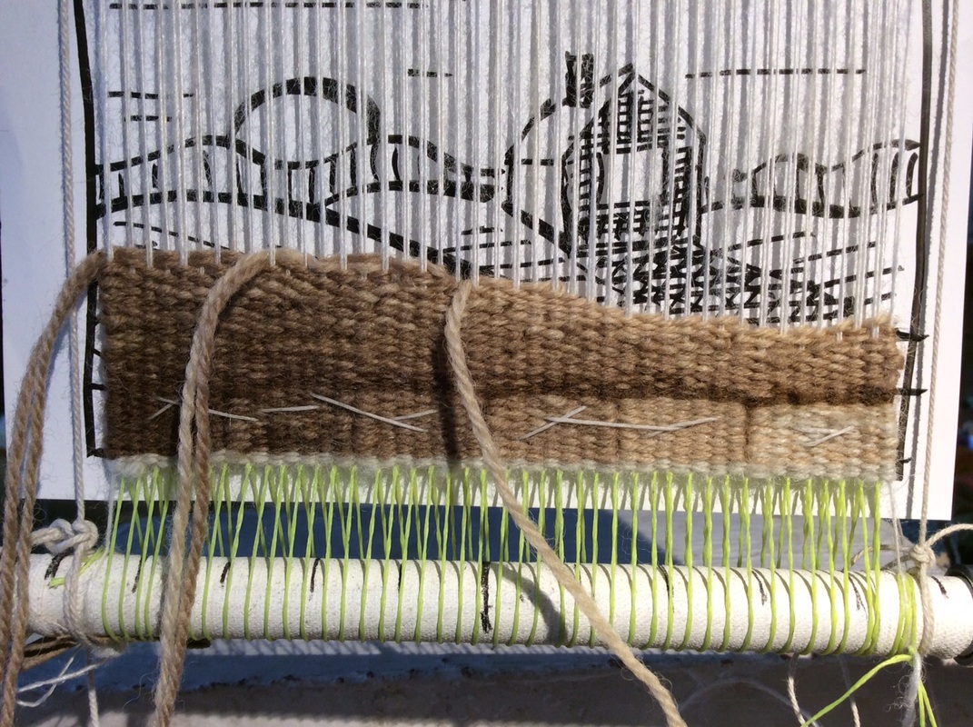
Decision 1. Start with the blend rather than the solid dark brown. There is already a nice weighty  lump of dark on the lower left that is echoed/extended by the line at the top of the color blocks and that should be enough.
Also, I want to minimize the number of bobbins I have to deal with.
 I hope to use no more than three values/blends across the shed, so starting with a blend means fewer bobbin changes. Irregular hatching allows me to build the shape  while evenly progressing from the shadowed hollow of the hill to the curved top where the last light strikes. 
Picture
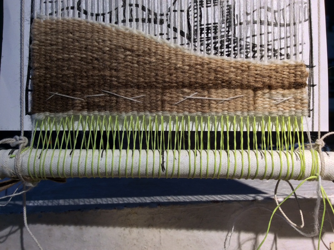
I wove most of the hill with the weft running perpendicular to the warp,
but added a line of eccentric weft -- a loosely draped final pass of light yarn--
all the way down the curved top of the hill to smooth and highlight it. 
Eccentric weft is a useful technique for defining a curved shape but
it can distort the surface of a tapestry if there is not enough weft in the shed to 'stair step' down the woven shape. It  also ceases to be effective if the angle or curve you are outlining is steeper than 45 degrees.


Value Question: Does the line of light yarn define the hill
or might an additional line of dark help to differentiate the first hill from the second?

Decision:  A line of dark will be important as the tops of  both hills have similar values.
Picture
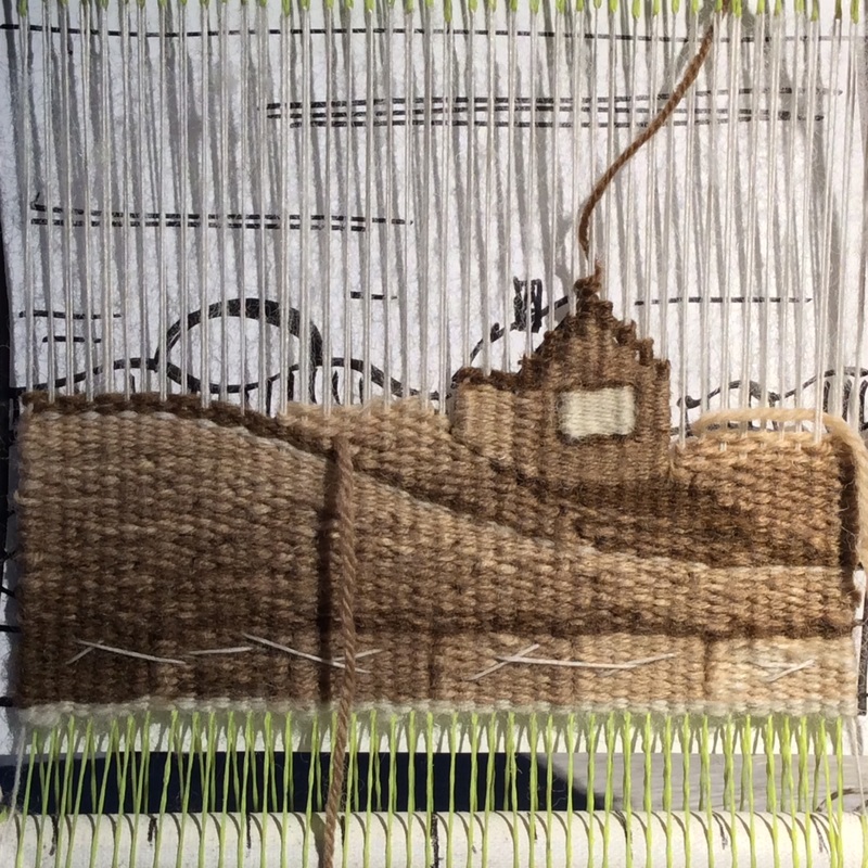
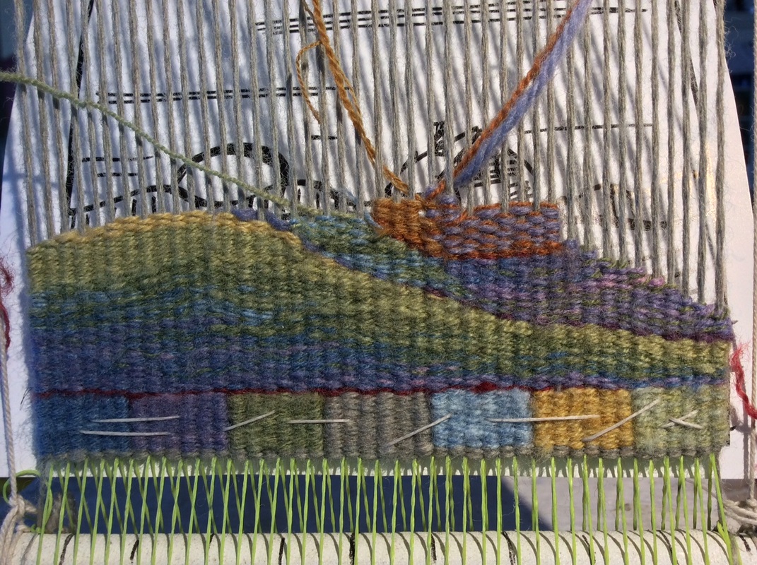
Value Question:  How dark should the house shadow be?

Decision: If the entire shadow is the darkest value it will be heavy/stark. Better to weave most of it in the second darkest value then put in just a tiny bit of the pure dark brown at the base of the house to anchor it to the ground.

Value Question:  I want the house to be a distinct shape but also belong in its environment.
Should the shadowed side be lighter or darker than the shadow it casts? 

Decision: Make the house lighter than its shadow and give it a slightly different texture than the surrounding land by weaving it with a single strand of yarn. 
  Slits will also act as lines on the sides of the house
differentiating it from the surrounding hills.
Make the window the lightest of all and use a single strand of the lightest yarn
to connect it to what I think will be the value of the lightest part of the sky/ sun 

Value Question: The roof--does it need an outline?
​
​Decision:  Yes. The outline defines the shape and implies a shadow, at least on the near side.

Value Questions: ​ But how light should the roof be?
​  How dark the distant mountains?
Picture
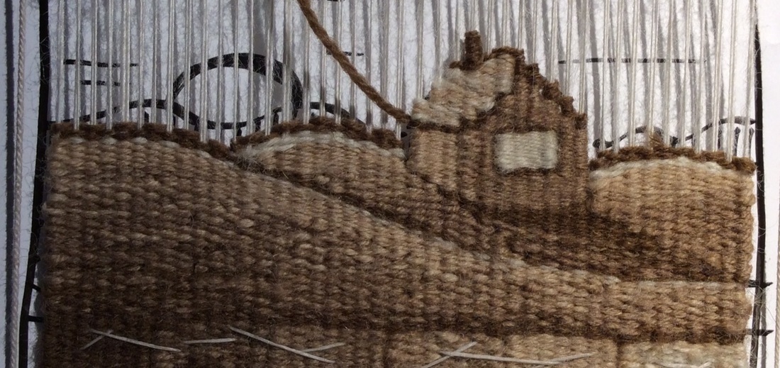
Decision: The roof should not be as light as the window, 
​nor as light as the brightest part of the sky behind it.
Its shape will be defined by the outline on the near and left sides.
The small slits on the left, between the roof and the sky 
also make a subtle line. It does not need  more.

Decision changed -- outline on the peak of the roof is too much. Remove.

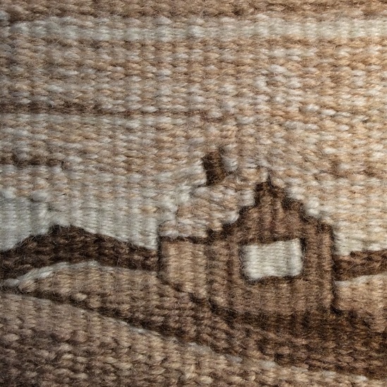
Decision: The distant mountains could be a middle value to allow for distance and atmosphere, but for some reason I decided to use the second darkest color.
​  Can't remember why but it must have felt right at the time.
Picture
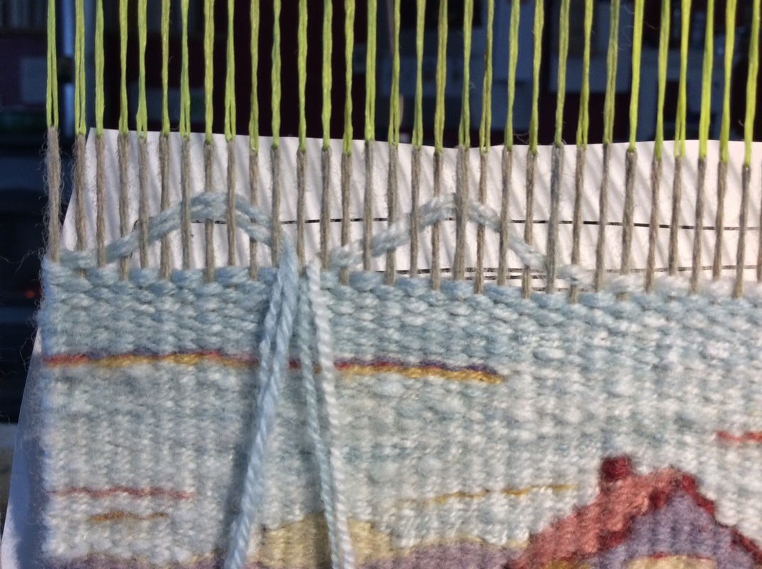
Note that the light sky behind the mountains is woven with a single strand of yarn (like the house) rather than two together. I think it makes it seem brighter. Also note that I did not leave a slit at the corner of the house, but joined the two color areas with alternating passes of weft. The window has slits on the sides.
Value Question:  How light should the sky be?
Uniform as in the cartoon, or should it grow darker as it moves toward the top?
How dark the clouds?

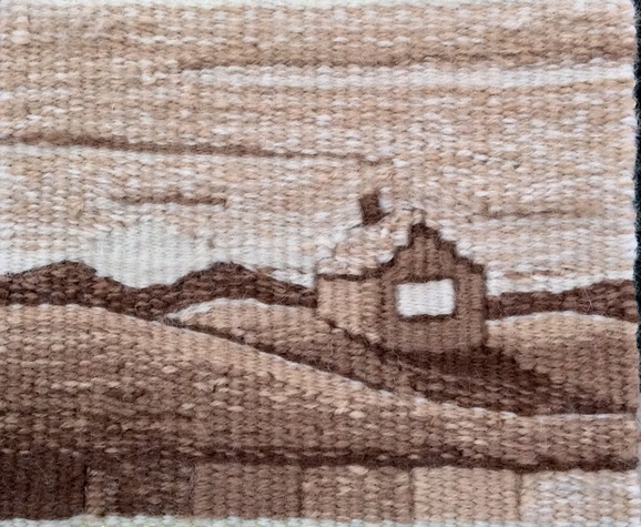
Decision: A few lines of cloud pull a hint of the darker value upward 
Light at the bottom of the top cloud makes it seem bigger and closer
and also pulls a bit of light toward the top of the image, helping the eye to move around.
The sky should get slightly darker toward the top as skies do,
​but not too dark or it will become heavy and shift the mood.
I know this because I made the top of the big cloud too dark when I first wove it.
I like it better now. 
Picture
House on a Hill; 3 1/2 " x 4 1/2" Wool Warp and Weft; walnut dye
This tapestry weaving thing
is like a long reciprocal conversation
between my hands and the yarn,
the yarn and my brain,
my brain and the image,
the image and my hands.
Round and round it goes with no right answers
but lots of interesting problems to solve --

small shifts of yarn,
micro dramas with every pass. 

and sometimes a bit (or a lot) of unweaving.
​

You never know what is going to happen.
Picture
The Last Few Pages; wool, natural dye; 18" x 24" ©Sarah C. Swett 2003
As I mentioned earlier, my first memories are of a mono-hued world.
Yet I now live in one filled with color.
How this came to pass I cannot say, but I like to imagine a few adventurous golden souls crossing the prairie into a world of blue,
 and cluster of green boats floating toward a region of red,
each hue sharing its skills and energy with the next.
​ What, I wonder, would it feel like to catch my first glimpse of violet if all I'd ever known was golden brown? 
The truth of that story will probably remain a mystery,
but however it unfolded, the colors among which I now live are hard to ignore.
Lively and thrilling like exuberant children, they demand to be part of everything
Picture
And why shouldn't they be?
We have dyes.
And eyes.
 Why not use these myriad hues to replicate the colors of in the world
and let value take care of itself?

Why not, indeed.


It is beyond the scope of this blog post to delve too far into color theory, for it is a lifelong study in itself, but value can't help but be part of the process, because colors have minds of their own and each hue, while consistent within its family, behaves entirely differently when hanging out with another.
​
Here is a small example of a color/value surprise that bit me even after decades of practice.
Picture
Picture
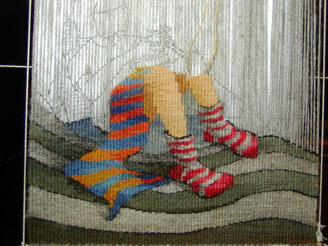
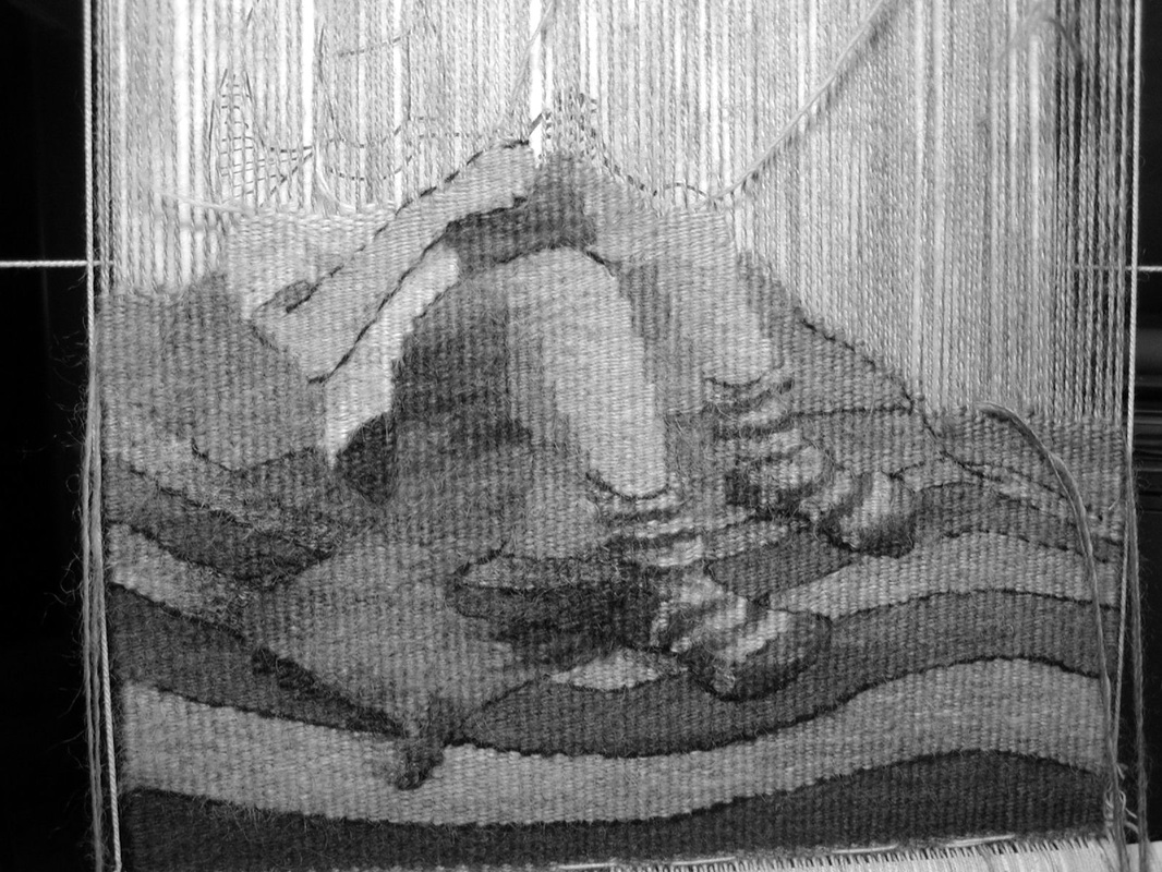
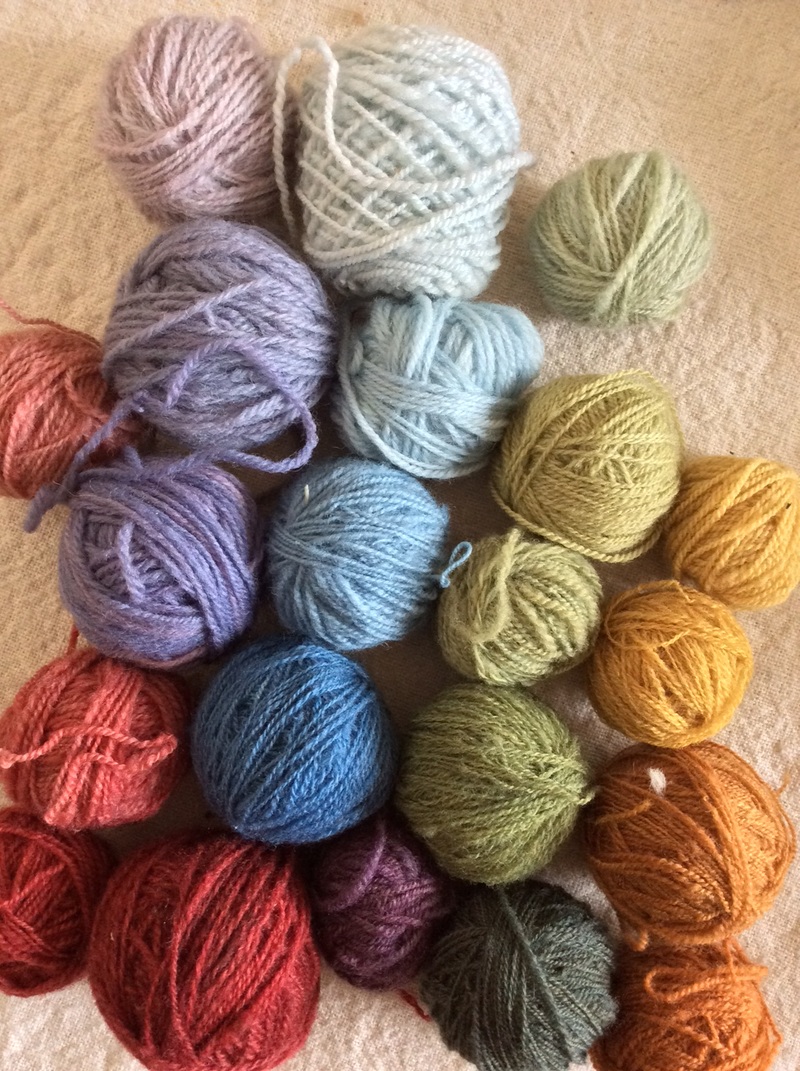
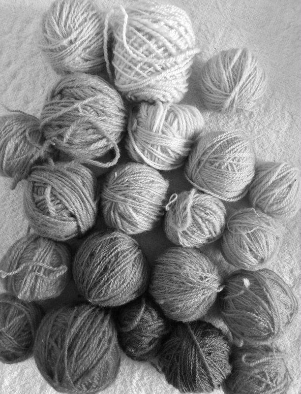
Take a look at the bright orange and blue striped scarf on the left.
See what happens when the color is removed -- stripes gone!

But why does that matter?
After all, you can see the object for what it is in color so
who cares about the relative lightness or darkness of the hues?
Who hangs out in a black and white world anyway?
Picture
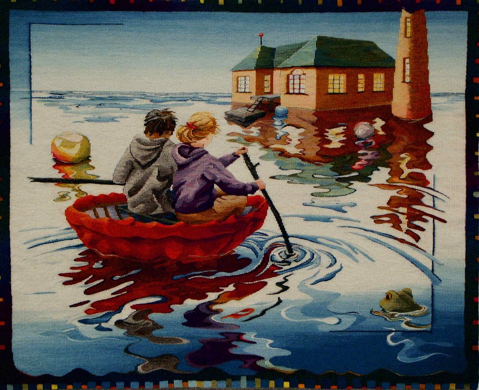
The Hut On The Rock; 40" x 48" wool, natural dyes ©Sarah C. Swett 2004; Notice that it is value that puts the coracle in the water and the people in the coracle. ​As the old saying goes, Value does the work, Color gets the credit.
PictureRough Copy #2 - detail in progress

Well I do for one, whenever I can.
Indeed, the best way for me to create really satisfying colorful tapestries is to begin in that mono-hued world I described earlier and not think about the color until I am actually weaving.
I can then choose every strand of yarn based on value choices I have already made.
This simplifies the early stages
and makes time at the loom incredibly exciting.

Here is my basic procedure: ​
Picture
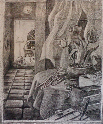
Miss Havisham's Gardener Cartoon; Graphite/ Paper 48" x 36" ©Sarah C. Swett 2005
1. Make a Line Drawing with pencil on paper-- sometimes borrowing from my own photos but mostly just lifting simple shapes and ignoring detail. I want to be in charge of what I weave and not leave it to a camera that doesn't understand sett.

2. Scribble in the value and define form with pencils-- big soft ones are the most fun.

3. Erase. Draw. Erase. Draw
Let image and mood evolve over time.
One area  might get lighter and lighter so even the darkest parts are lightish.
Another, less of a focal point, might become muted so even the white things are grey.

4. Continue  till I can't think of anything else to do.
5. Enlarge my cartoon (if necessary), build a loom and warp it,

6. Choose one  ball of yarn. All I need initially is something for the border. Everything else can and should build on that. Make subsequent choices based on what I have already woven.
Wool is not colored pencil, nor is it a marker, watercolor or light on a computer screen. It is a flexible column of air surrounded by many tiny fibers with untold facets and it, that thing we call a strand of yarn, will behave differently when woven than it does in the ball.
I cannot know how it will look until it is actually packed in. 

7. Arrange colors by area. When it is time to begin a certain part of the cartoon, I gather the value range for that thing in one basket: this group for the table cloth, this group for the floor, all the while comparing the relative value of that group with the cartoon and the other forms around it. Then I Continue to check the relative value of the yarn as I weave. Adding and subtracting as necessary.
​Once upon a time I did this by squinting or looking at things in low light. These days, there are camera filters and apps that'll give you an idea of relative value in a second, though I still get to make the final decisions about everything. Cameras are not to be completely trusted.

​Go for the glow.
Picture
Picture
Notice how the red on the bottom left is darker than the blue above it and how the darkest green on the lower right is only slightly darker than the orange on its right.
Notice how all of the reds are darker but also brighter than the blues.
Plan to use them deliberately and sparingly.

8. Spin and/ or dye to fill out the range or shift my color/ value focus in response to how the tapestry is unfolding.

9. Remain alert for unexpected design/color/value thrills and pitfalls 
Picture
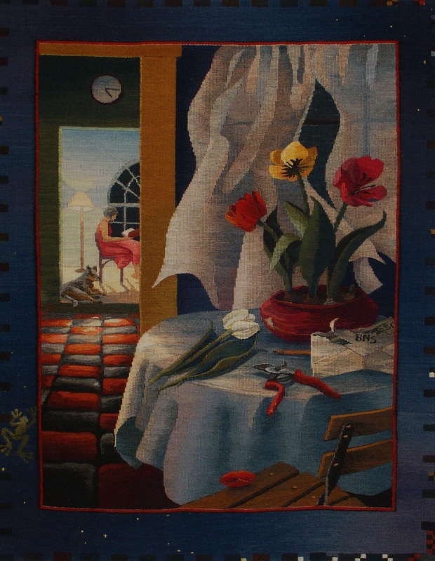
Miss Havisham's Gardener 50" x 38" wool, natural dye ©Sarah C. Swett 2005 NOTE: on the red floor the lightest red on the near tiles is the same yarn as the darkest red on the far tiles.
Noticing value is a thing for which a person needs to get in shape,
like running or  birdwatching or playing music.  
The only way to do it is to do it--over and over until chords become your friends
and 
a kestrel is a kestrel even whizzing by in a car.

It is curious, actually, that most of us will play tunes again and again to get them right, but rarely reweave the same cartoon. Yet each time there is the potential to notice something new.
Having already made some decisions, and knowing from experience what works and what doesn't in, say, shape building, you are free to push color blending or value .
  Or do it the other way--first focus on color blending and then on shape making. 

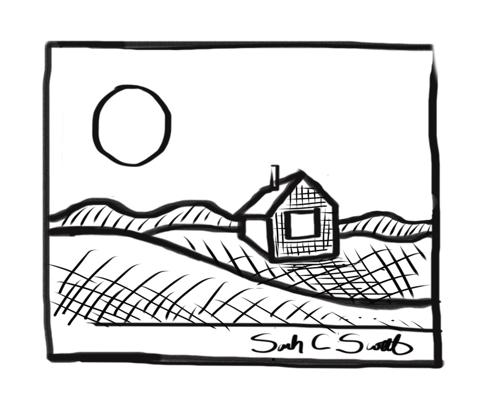
To help with this practice, if you're interested, here is a PDF of the cartoon for House on a Hill,  the little brown tapestry I wove in detail up above. There are two versions -- with and without value hints, with and without a sun/ moon in the sky. 
 Click here, or on the image below to download it.
Print it out more than once if you like, and see happens with your hands and eye and yarn.
Picture
Working on this post made me want to weave a color version myself.
Below are some images of what I did (with less commentary than the brown one).
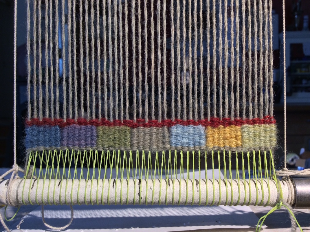
FYI:​ I was aiming for approximately the same value range as in the first.
Picture
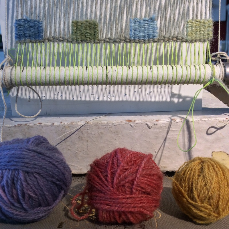
A place to start -- purple, green, blue from dark to light
Picture
The red looks great as a ball of yarn with the other balls of yarn, but maybe too bright when actually woven?
Picture
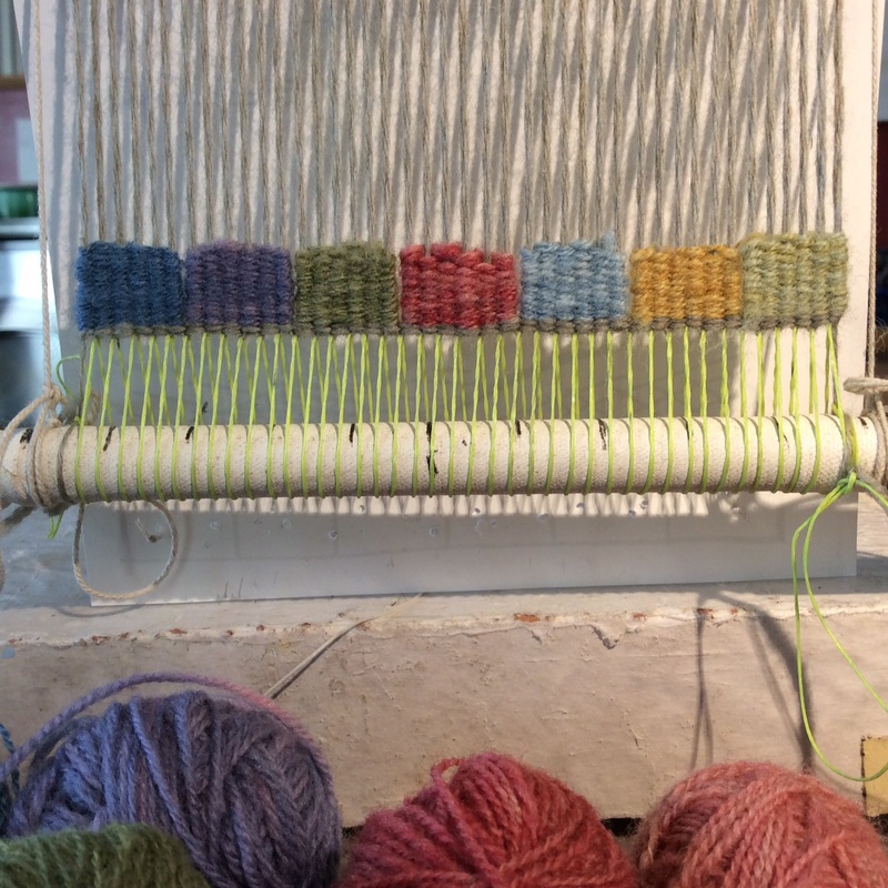
In black and white, the red block fits into the progression, but is a little dark
Picture
I decided that the red block was both too bright and too dark for its position at the bottom of the tapestry. The greyed green works better, but now the blue and yellow leap out. At this point, I imagined the house could be red, so wanted a little bit of that hue elsewhere. The line above the color blocks might do the trick -- dark but bright, the way red is.

​As I wove this, I kept imagining other variations:
- If I turned the sun into a moon and made the the sky dark, what would the land do?
-If the darkest value were a creamy grey and the whole range very light, what would the landscape feel like?
- How dramatic could it be if the range of values went all the way from black to white?
Picture
Light yellow/green on top of the hill but no dark line.
Picture
Value blending in the sky. When I started I thought the house would be red. Turned out it was supposed to be the roof. This is a lesson I learn over and over and over.
Picture
The dark line only sits on the lower part of the hill
Picture
Pulled a little gold and red up into the sky.
I'm probably not going to get around to answering all these questions, 
so can you?
And if you do, can you show me how it turns out?
On Instagram use #tapestryunlimited and tag me (@sarahcswett) 
On Ravelry  join the Vancouver Yarn Ravelry Group-- #tapestryunlimited 

Thank you for reading so far
and I wish you the best of good fortune with all the tapestries in your future.
Here are a couple of final thoughts..
​
1. Own you work-- 
and notice what you like

not what you think someone else will like,
or you think I might like,
but what actually stirs you. 

Love value transitions but hate hatching? Learn to dye to make the intermediate values.
Love color blending and value transitions but hate dyeing? Try weaving with different materials to get the values you seek -- perhaps texture and shadow can play a part.
​If you are a spinner, start with dyed fiber and blend with cards or combs.
Love value but are annoyed by color?  Weave your own mono-hued world.
Picture


2. Relish the open space between art and craft where tapestry weavers dance in the sun,
 working with concepts that create art and practicing skills essential to the craft.
Tapestry is a medium of endless potential,
ancient and contemporary at once,
and the structural limitations of warp and weft are a source of tremendous freedom. 


​
 3. So go forth and weave. ​
​
​The world needs your work.
 So does the  American Tapestry Alliance (ATA)
 and its Tapestry Unlimited Exhibition,
an unjuried exhibition designed to showcase our best efforts at whatever level we find ourselves. There is more about both ATA and Tapestry Unlimited below,
but first, I want you to know that ATA is offering two prizes for participating in this blog tour:  
The first is a one-year membership to the American Tapestry Alliance. The second is a one-year membership to ATA plus a free entry to the exhibition.
Current ATA members are not eligible to win, so there is lots of room.
I signed up for the exhibition today.
​ See you in the catalog!
a Rafflecopter giveaway
The American Tapestry Alliance is a nonprofit organization that provides programming for tapestry weavers around the world, including exhibitions, both juried and unjuried, in museums, art centers and online, along with exhibition catalogues. They offer workshops, lectures, one-on-one mentoring and online educational articles as well as awards, including scholarships, membership grants, an international student award, and the Award of Excellence. They also put out a quarterly newsletter, monthly eNews & eKudos and CODA, an annual digest. Members benefit from personalized artists pages on the ATA website, online exhibitions, educational articles, access to scholarships and more. 
---------
This blog tour is in celebration of ATA's annual unjuried exhibtion. Tapestry Unlimited; 11th International, Unjuried Small Format exhibition is open to all weavers. We are expecting upwards of 250 participants who will show their work at the Milwaukee Public Library this upcoming summer. Everyone who signs up to participate by January 31st 2016 will be included in the exhibition, and your tapestry does not need to be mailed to us until March 2016. There is an exhibition fee of $40 which pays for both the return postage for your tapestry as well an exhibition catalogue, which everyone’s tapestry will be featured in. We invite entries which work within more traditional definitions of tapestry as well as ones which expand upon them, including multimedia work.
Lee (Leonora) Bishop
1/27/2016 10:10:47 am

Than you very much for sharing your knowledge. I have enjoyed the blog tour every much. I look forward to keeping track of your and all the instructors in the future.- This has been a wonderful activity and if I can find the entry fee of 40 in my budget I will ener my tapestry.

Thank you again, Respectfully,

Lee Bishop

Bonnie Klatt link
1/27/2016 10:28:23 am

EXCELLENT, Sarah!!! Educational, colorful (or not), clearly explained, great photos, encouraging, and entertaining. What more could we ask for? Brings back memories of The Value of Value at Chautauqua (EGLFC)...and makes me want to put a warp on. ;)

thais donald
1/27/2016 10:41:54 am

I have followed the blog since the beginning, and found it most illuminating. I especially enjoyed the last two blogs dealing with colour and values. Thank you so much to all of you for so generously sharing your knowledge and experience.

Jennifer Bennett
1/27/2016 10:49:43 am

This is a fabulous blog post Sarah and amply illustrates the importance of value, or tone as I know it- something easily underestimated in designing tapestry! I think you've proved tonal black and white tapestries are just as interesting, if not more so, than a riot of vibrant colours! Loved all these posts- thank you to all your brilliant weavers!

Ineke
1/27/2016 10:50:46 am

Thank you this was an extremely clear way of explaning hue And value. And I know I need a lot more practise.

Nancy Kramer
1/27/2016 10:57:01 am

Sara, thank you, thank you, thank you for this marvelous and insightful blog. Love getting into your decision-making mind and seeing you pose the essential questions. Did I say thank you? Thanks much.

Ama
1/27/2016 10:58:07 am

What a thorough, humorous, and delightful read - thank you so much for sharing your knowledge and experience with us! I'm finding these issues of value more and more important (and difficult to get right!) as I learn and develop more intuitive skill. Now to apply this to my current piece on the loom..

Angie Simon
1/27/2016 12:22:47 pm

Thank you! I know I will be referring to this post many times. I especially appreciate your phrase (although not specifically related to the topic of value)... "so I can start weaving without much angst." Blocks it is!

Susan White link
1/27/2016 01:36:06 pm

Great post as usual Sarah. I will be sharing with others who are trying to understand value. I have long loved the quote, whoever it belongs to, that value does the work and color gets the credit.

Marjorie McLaren
1/27/2016 01:40:23 pm

Wonderful post! Love the idea of value blocks at the beginning, and limiting the values/colors. Very inspirational!

Michele Dixon
1/27/2016 03:01:11 pm

Thank you Sara. What a wonderful post. Lots to think about and I know I'll be coming back again and again to reread sections. Also, I am sending a small tapestry to the ATA Unjured Show.

Karen Greeley
1/27/2016 04:02:17 pm

I feel like I just finished an entire workshop on value in tapestry! Thank you for showing how you do what you do. I've been fluttering around drawing and redrawing and stuck on choosing colors. Now I will go start with dark and light.

Sharon Elliott
1/27/2016 06:46:25 pm

Thank you for sharing your thought process, step by step. It was enlightening. By the way, I am using your book, Kids Weave, to build pipe looms with a group of students at my school. It is very exciting. Thank you for your good book with its clear instructions.

Eileen VanBronkhorst
1/27/2016 06:51:18 pm

Sara, wonderful blog. Thank you for sharing your talent. It is almost as good as being with you in person at a workshop. Fabulous!

Ruth Manning link
1/27/2016 07:04:39 pm

questions, then decisions.....I like that so much better than worrying about not having answers for things, something I struggle with...Thank you dear Sara for putting in words what I believe and work toward every day - it's all about value.

Sarah
1/29/2016 08:38:28 pm

And thank you, Ruth, for your lovely words and inspiring work..

Rebecca Mezoff link
1/27/2016 07:27:50 pm

Lets own our work, dance in the sun, and go forth and weave... indeed. Thank you from the bottom of my tapestry-loving heart.

Heather Myers
1/27/2016 08:01:16 pm

Thank you for the wonderful lessons! And illustrated with beautiful tapestries. I'm forwarding it to my artist non-tapestry friends as well as fellow weavers.

Glennis Leary link
1/27/2016 08:19:03 pm

Thank you for this most informative blog. There is much to learn here and much to be inspired by.

Patti Kirch
1/27/2016 09:53:50 pm

Thank you Sarah,
If ever you print "The Value of Tapestry" as a zine or published book it would be a valued and well used reference always beside my loom. YOU, your words, stories and your Art are magical, wonderfully magical
weaving daily can't stop ; )
patti

Jayne
1/27/2016 10:53:35 pm

Thank Sarah for a very insightful blog post ....I will need to re read it put it into practice and no doubt go back and re read it .... Thank you for sharing your knowledge.

Pat S
1/28/2016 01:41:57 am

I have learnt much from this blog tour , espially the posts by Sarah and Elizabeth. The idea of sharing knowledge in this way and at this time of year , leading to the ATA unjuried exhibition has been a very smart move. I will revisit these posts often as I strive to improve what I weave. Thank you for everyone concerned, especially the weavers who contributed their knowledge and experience.

DebbyG
1/28/2016 04:14:06 am

Wow, this was so interesting and well done! Thank you! I'm glad the tour led me to discover your blog.

Tamar Shadur
1/28/2016 06:50:45 am

Sarah, this is a superb blog, so poetically and aesthetically put together and highly instructive. Value has always been on top of my tapestry considerations, but you have revealed a clearer process here. Thanks very much!

Nancy Nordquist
1/28/2016 09:06:14 am

What a great post! So beautifully written and so helpful. It is timely, giving me a set of questions to ask to help me get started with my own entry for the small format show and a reminder to make it the tapestry I want it to be. Thank you!

Linda Brandwein
1/28/2016 11:55:37 am

Great post! I like how you used black and white shots to show the difference in the colors. Appreciated your narrative and the questions you posed.
Thanks.. Great inspiration!

Dana Schultz link
1/28/2016 12:46:14 pm

Oh, my! I have learned so much from you! Thank you.

Sandra Schniepp
1/28/2016 07:15:25 pm

Oh please continue! This has become such a wonderful part of my week. I look forward to the inspiration and learning. Your post certainly gave me a great deal to experiment with.
Angela Colbridge
1/28/2016 11:50:34 pm

thank you so much for taking so much time to put this tour together. it has been very thought provoking and has given me new inspiration. It has been so lovely knowing this has been shared with so many like minded people around the World too. Off to the loom now! Thank you

Stephen Threlkeld link
1/29/2016 03:59:08 am

I am encouraged by this piece to do a color gradient I've wanted to do for a while now. Thanks.

jane
1/29/2016 04:04:48 am

Just came across your site and I was wondering which loom is being used thank you

Sarah
1/29/2016 08:37:14 pm

Hello Jane,
The loom is one I built out of 1/8" black/galvanized pipe. There is more info--dimensions etc--in a post I wrote a few weeks ago..Should be in the category "vague instructions". Thanks for reading!

Sandy
1/29/2016 08:35:05 am

Sarah, I have admired your tapestries for years and I am so happy to have the opportunity to thank you for this generous sharing of your approach.

Susan Love
1/29/2016 08:46:00 am

Loved your blog about value. The more I learn I realize how much goes into creating and that I need to keep learning and learning if I want to join the tapestry conversation. This blog tour has been a great way to get acquainted with some wonderfully talented tapestry artists and to learn from them. Thank you!

Donald Sandoval
1/29/2016 08:59:17 am

Amazing article about color value. Your work really demonstrates the ideas you are making with spectacular results! Thanks for all the recommendations and tips I really appreciated and enjoyed this blog post!

Mickey Anderson
1/29/2016 09:26:29 am

Thanks for all the information on value. I did pick up one of the red plastic bits that is supposed to help with color choices but I still get surprises with my selections. I have followed the tour and now have a new way to warp and I will be going over some posts again and again to help with color and value.
May the fleece be with you.

Grace K.
1/29/2016 05:52:01 pm

Love the value lesson!
Thank you.

Sarah
1/29/2016 08:44:21 pm

What a delight to read all these kind comments. Thank you all for visiting, reading and letting me know you were here.
It has been amazing ...

Azita Turner
1/30/2016 02:25:47 am

The information, techniques, lessons shared by so many incredible and MASTER weavers here is priceless. I learn so much from each one & I'm inspired by some to actually dare to plunge into this mystical realm of weaving … a story, a painting, a magical instrument of healing that all their works of art feels like…

Thank you all so much for sharing your world & work of art with me.

Azita Turner

Azita Turner
1/30/2016 02:43:02 am

Sarah,
My earlier comment above was meant for the ATA page. Sorry I left it in the wrong spot. But I meant to tell you that your page about Values (and so much more) has me mesmerized. Your style of teaching, and the intricate detail & beauty in your tapestries are awe inspiring.

Thank you so much for generously sharing your magic…

Azita Turner

Betsy Snope
1/30/2016 08:19:24 am

Thank you for a wonderful lesson. A lot to take in but very necessary for me. Admire your work very, very much. Love weaving tapestry but am design phobic. The value lesson was very valuable (sorry).

Victoria Stone
1/30/2016 11:06:50 am

Hi Sarah,
Thank you, thank you, thank you. This blog talk about value and your process is amazing. I read it quickly when it was published, then read it slowly today, and plan on "nibbling" on it in the future!
Thanks for being so generous with your knowledge and ideas.

Cindy D
1/30/2016 05:00:33 pm

The post on value is amazing. It is definitely a wonderful concise tutorial on value and has given me lots to think about. Thanks so much for doing this. I have enjoyed all of the blogs in this series and think that this was a wonderful project.


Erica link
1/31/2016 01:03:35 am

Wow! What a clear, thorough, and extremely helpful tutorial! Your control of value while using so much colour is is one of things I have always admired in your work, because I always seem to be distracted by the colours themselves and often forget this important principle. Thank you for the wonderful tutorial !


Comments are closed.
    Picture

    ​Sarah C Swett 
    tells stories
    with
    ​ and about

     hand spun yarn. 


    Picture
    Click for info on
    my four selvedge
    warping class
    with
    ​ Rebecca Mezoff  
    fringeless


    Categories

    All
    Backstrap
    Books
    Cellulosic Experiments
    Clothes
    Coffee Filter Yarn
    Comics
    Distractions
    Dyeing
    Embroidery
    Hand Spinning
    Knitting
    Linsey Woolsey
    Looping
    Mending
    Milkweed
    Out In The World
    Plain Weave
    PVC Pipe Loom
    Shoes
    Sketchbook
    Slow Literature
    Tapestry
    Textile Tools
    Things To Wear
    Vague Instructions
    Willow

    Archives

    September 2021
    June 2021
    April 2021
    March 2021
    November 2020
    October 2020
    September 2020
    August 2020
    July 2020
    May 2020
    April 2020
    March 2020
    February 2020
    January 2020
    December 2019
    November 2019
    October 2019
    September 2019
    July 2019
    June 2019
    May 2019
    April 2019
    March 2019
    February 2019
    January 2019
    December 2018
    November 2018
    October 2018
    September 2018
    July 2018
    June 2018
    May 2018
    April 2018
    March 2018
    February 2018
    January 2018
    December 2017
    November 2017
    October 2017
    September 2017
    August 2017
    July 2017
    June 2017
    May 2017
    April 2017
    March 2017
    February 2017
    January 2017
    December 2016
    November 2016
    October 2016
    September 2016
    August 2016
    July 2016
    June 2016
    May 2016
    April 2016
    March 2016
    February 2016
    January 2016
    December 2015
    November 2015
    October 2015
    September 2015
    August 2015
    July 2015
    June 2015
    May 2015
    April 2015
    March 2015
    February 2015
    January 2015
    December 2014
    November 2014
    October 2014
    September 2014
    August 2014
    July 2014
    June 2014
    May 2014
    April 2014

things to make:
yarn . music . friends
whatever it is you cannot 

not
begin
Proudly powered by Weebly